
Do you want to know why your conversions are still flat? Even though you have hired professional Amazon photographers, videographers, and content designers. Your professional Amazon photographers and videographers can’t seem to capture the attention of your customers with their amazing work! The content design is top-notch, but it doesn’t translate into sales. What do you think is resulting in lesser conversions and sales in such a complicated situation?
The situation might sound familiar to almost every Amazon seller as one in every two sellers are likely to face the same problem. Guess what? I have found a solution to this problem for you.
Read More:- 100s of Amazon sellers donated their products to Charity!
What better way to find out what is selling on Amazon than by looking at the top sellers? After 5 months of research and going through 15,000+ listings, I was able to figure out a consistent pattern in best-selling products.
One thing that is common in almost all best-selling products is the use of special marketing strategies. It is called VISUAL REFERENCES!
What is a Visual Reference on Amazon?
Visual reference is when you are explaining your product’s feature or benefit in a visual manner using relevant references. Sounds complicated, right? Here is an image explaining how a simple visual reference can simplify complicated equations.
For instance, you are selling a delivery bag and your unique selling point is that it is extra large.
You have two options to create an image that shows this USP.
Option 1 (commonly used but ineffective):- Create an infographic that shows the Dimensions of your product.
Options 2 (great visual reference, highly effective):- Show how many pizza boxes and food they can carry. Let’s say, the commonly ordered food online is pizza. Show that your product can carry 5 extra-large pizzas, 2 small bags, and 2L bottles of pop.
Both options have explained the same feature but in totally different ways. Our research shows that images with visual reference sell a lot better.
But how?
Humans are visual creatures who process information more quickly when it’s presented to them in an aesthetically pleasing way. Numbers, icons, and shapes can confuse the human brain resulting into a higher bounce rate; however, if you dumb down your copy with visuals such as colors or images then this problem is solved because buyers’ minds will be able to receive all messages instantly without any confusion whatsoever!
Read More:- 3D Rendering vs Product Photography & Which One Is A Better Option For Amazon Sellers?
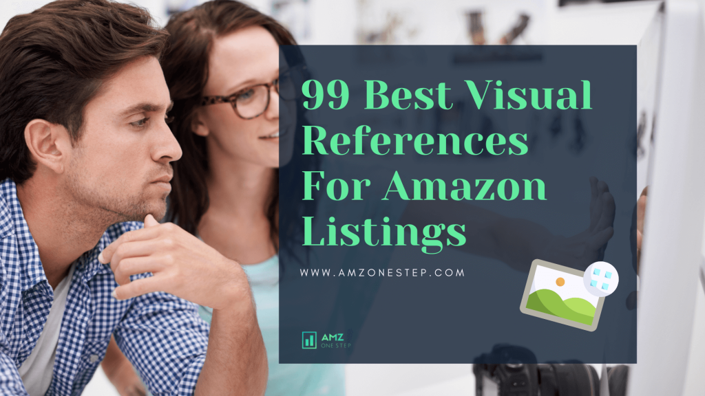
I have found 99 best visual references that you can take inspiration from and succeed on Amazon.
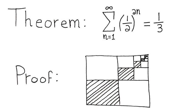
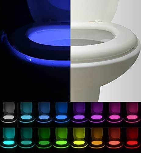
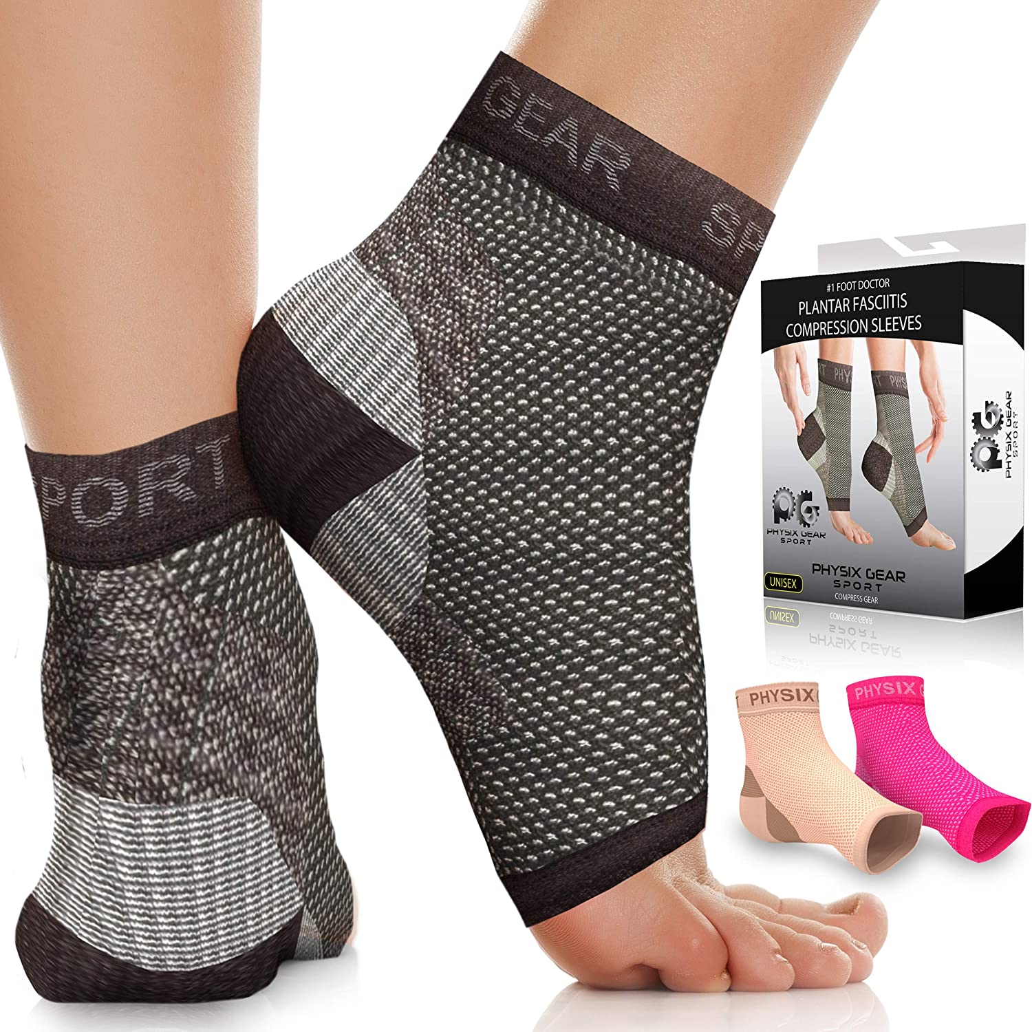
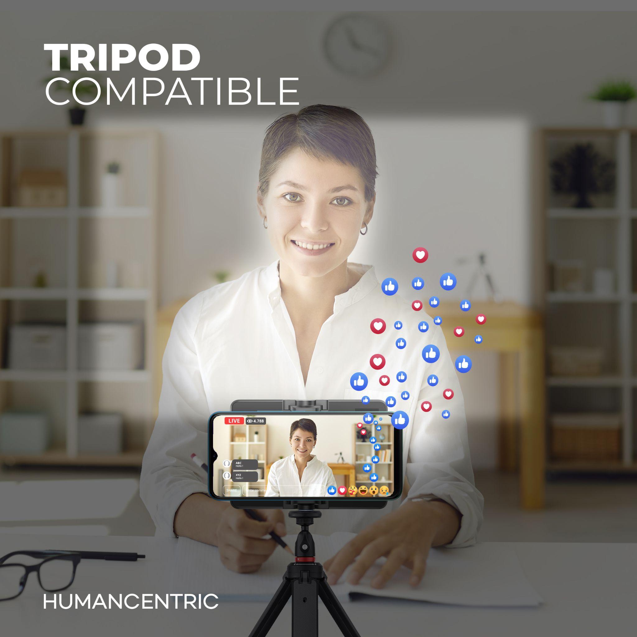
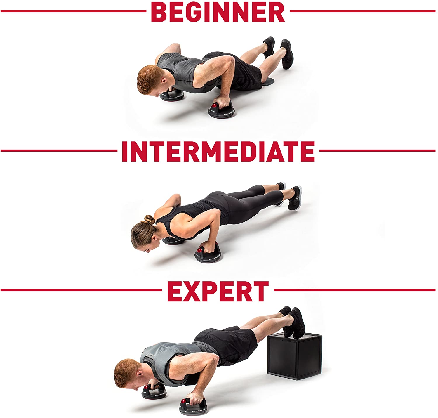
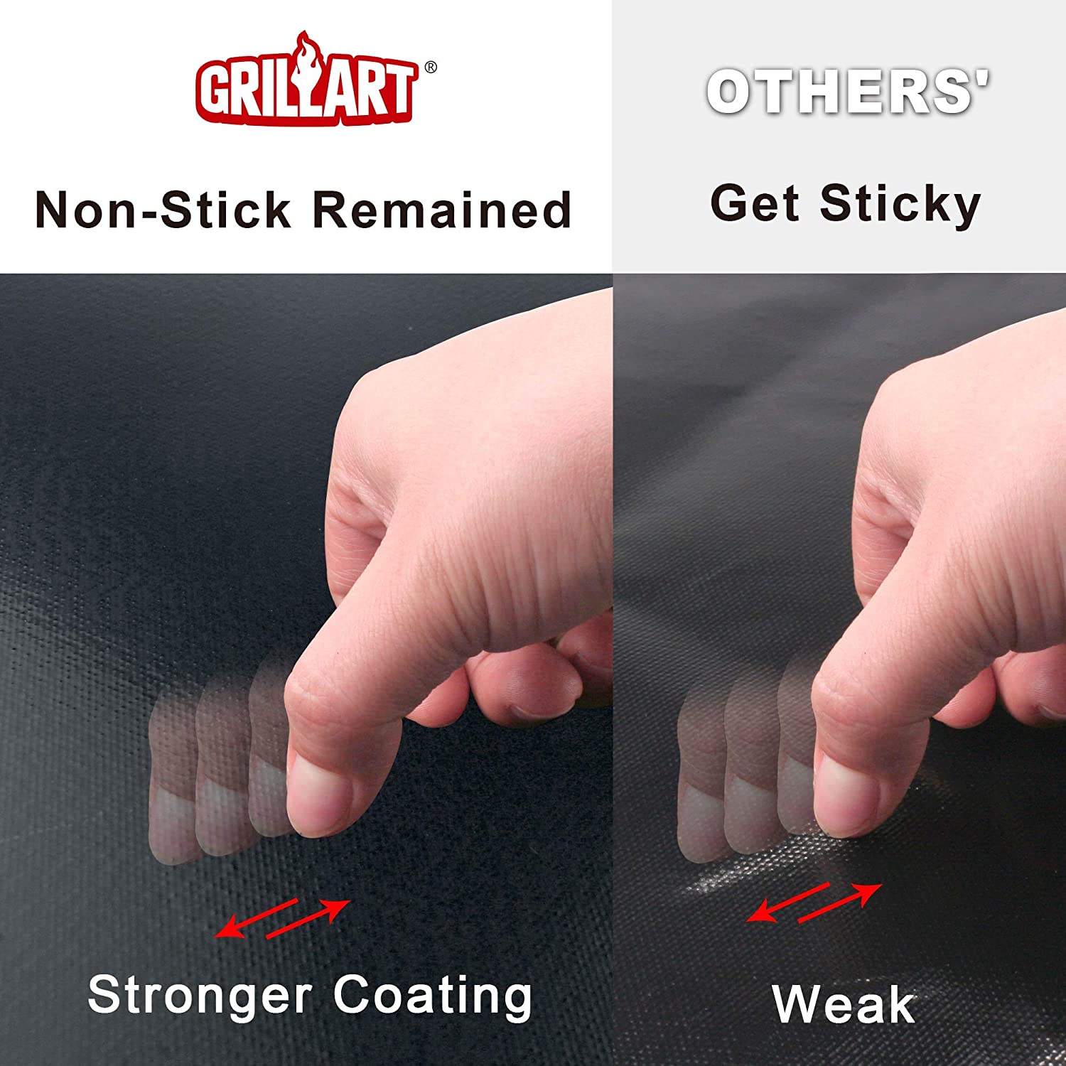
1. When we look at the image, it is easy to see how effective this product is. The strong contrast between both legs shows a great comparison. The juxtaposition of the legs enforces a strong image in the consumer’s mind. Everyone can see the clear difference between both legs. There is no cutting or cropping, and the comparison is visible in the same picture. The powerful visual contrast is helpful in convincing buyers.
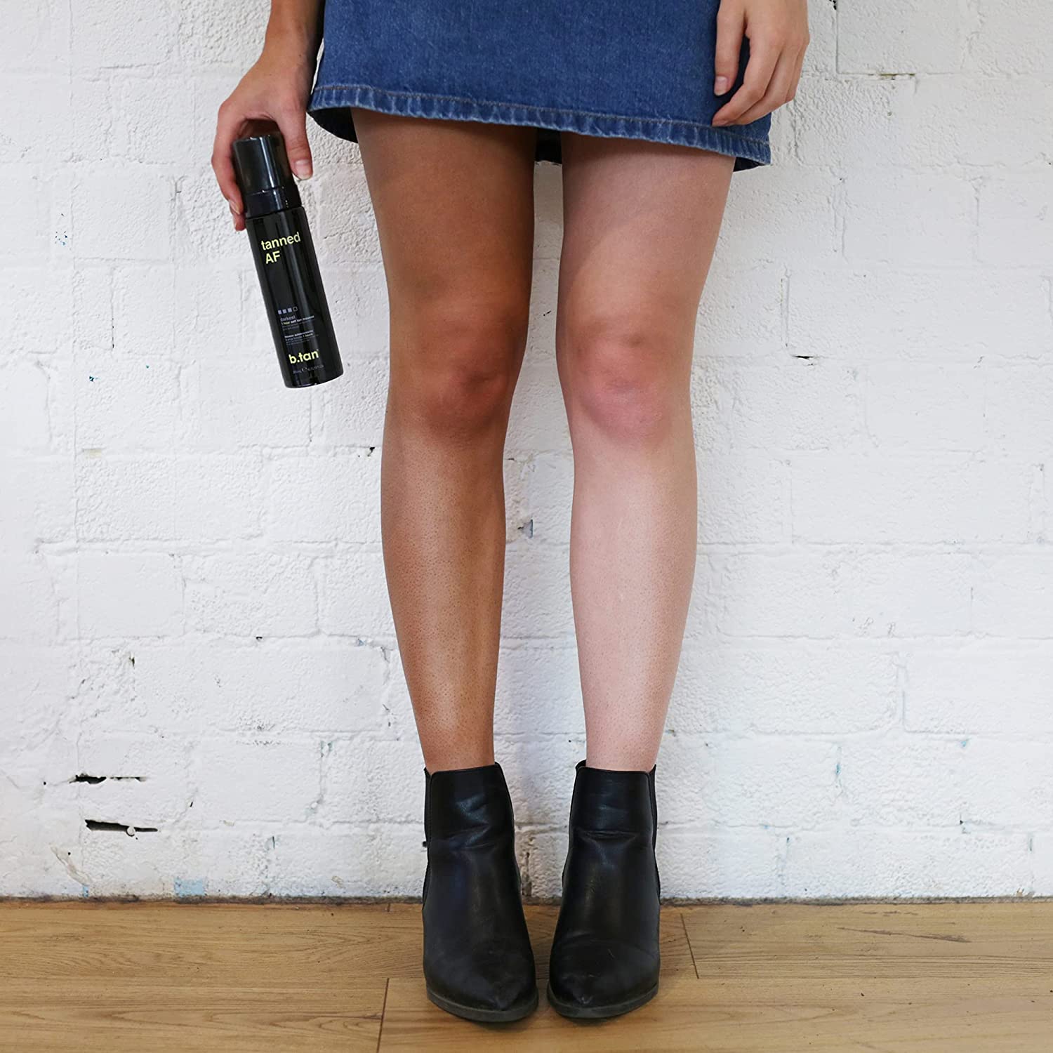
2. The separation of the three components shows how the product works. The visual reference helps consumers to understand how the lock functions. It is very clear from the image that the design is very original and creative. It really makes you think about how people will use this product, which in turn helps them understand its benefits better. The sleek design and purpose of the product, are pretty evident in this image.
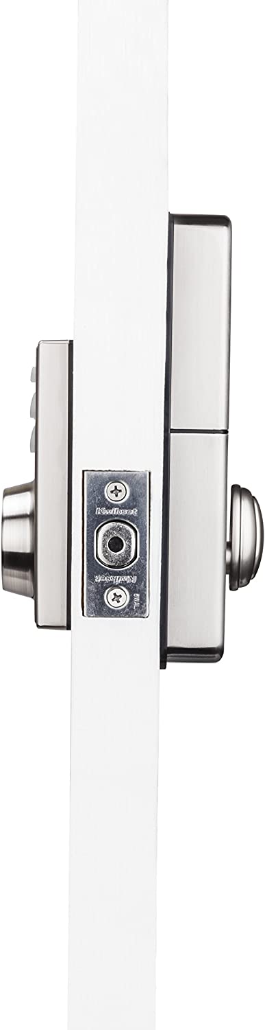
3. With the big red cross and sad emoticon, it’s clear that the product will not work with any of these devices. The green text has a smiling face to show how it is compatible with only this specific kind of device. Users will immediately know on which device it can be used just by looking at this one image.
4. The visual reference shows variations of the product, with different colors informing users that they have a choice in color. Consumers can pick any hue as per their preference and desire! Image half colored and half white is giving a sense of differentiation to the product. It is adding an element of appeal as well that is helpful in convincing buyers.
5. The before and after images create a clear vision of what the buyer can expect from using this product. In turn, it helps them understand how much more organized their workspace will be with just one purchase!
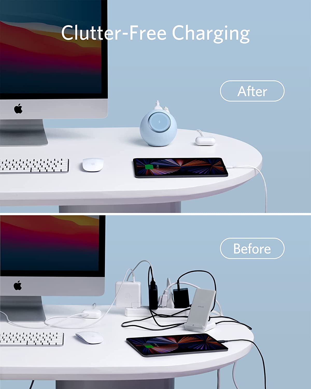
6. The above image indirectly references how many products can be charged with the single charger, as it includes different electronics around it while still keeping the focus on the main product. It also signifies how small and portable this product is. Everything that users want to know about the product has been highlighted in a single image.
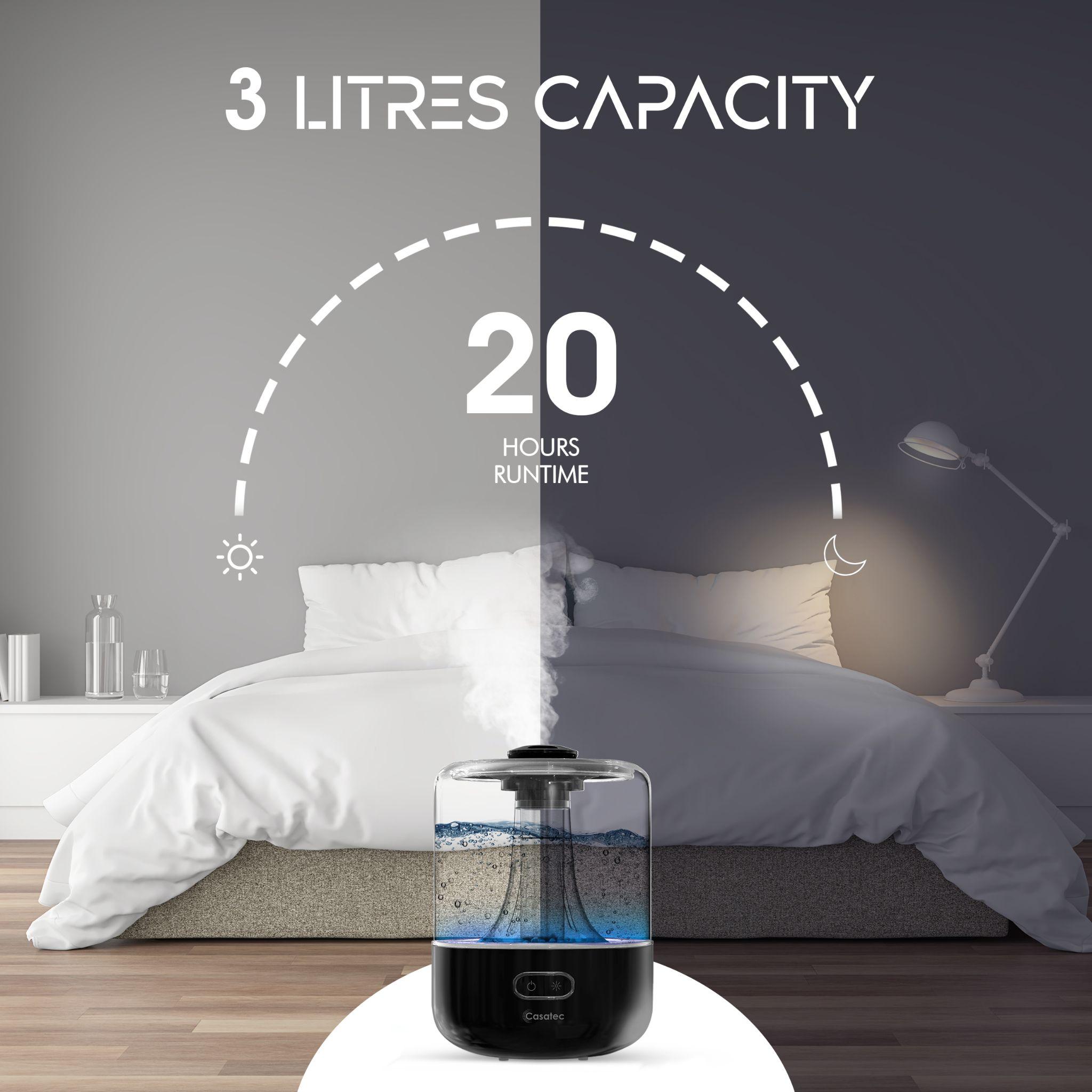
7. The following infographic divides the image into two halves with a distinct line to help visually indicate the passage of time outwardly implying that once filled, the humidifier will last throughout the day and night. Mentioning 20 hours in the image certifies its effectiveness that buyers really want to know before making a decision.
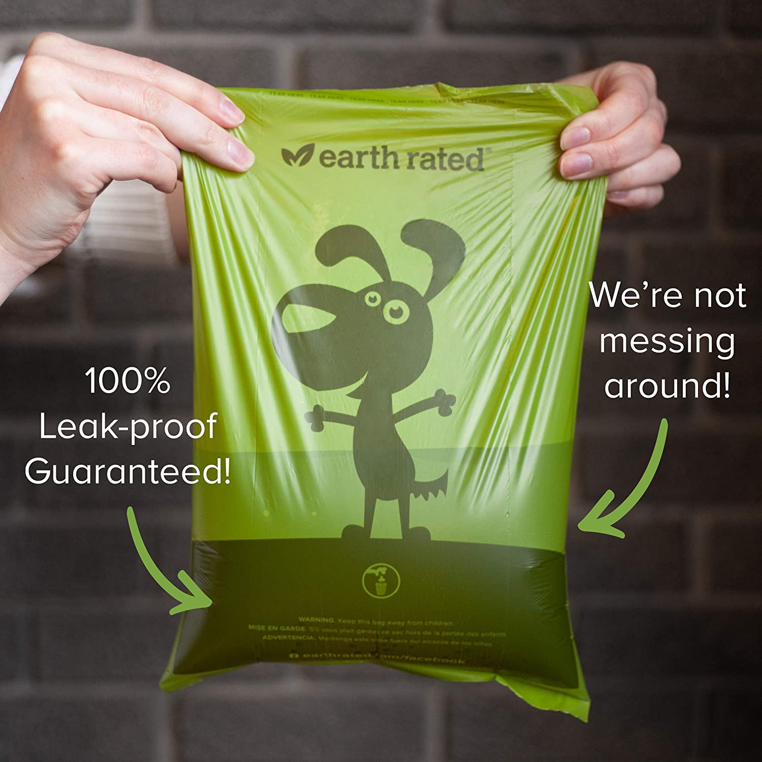
8. The picture of this product being used to demonstrate its distinguishing feature, leak-proof! The design has been carefully thought out so that you might not see any leaks or spills on it; users know just by looking at the refined exterior that this product is worth buying.
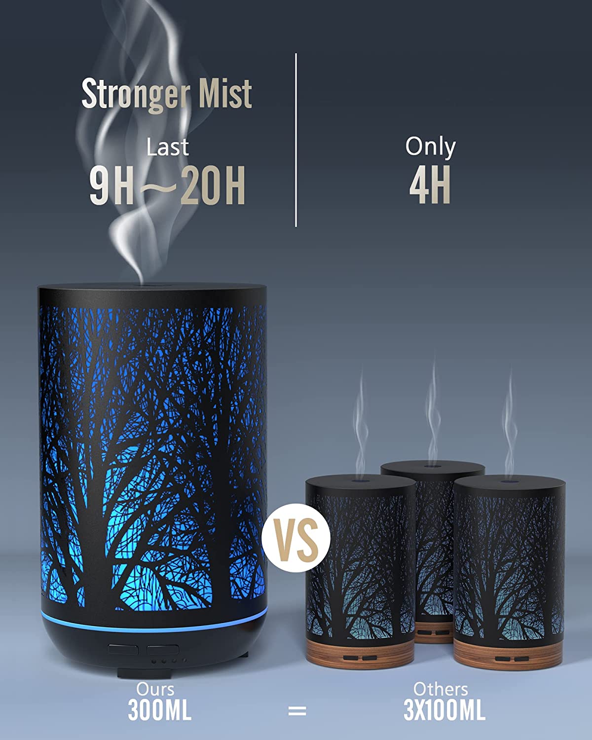
9. The following comparison image visually references how when you invest in one big candle, it’s better than getting three smaller candles. Additionally, it is signifying how the bigger product is giving out stronger and better-lasting mist as compared to multiple smaller candles.
10. Creatively combining images and juxtapositioning the product in use helps simplify how it can be used in multiple ways. Additionally, the hand holding the product in the second image indirectly shows how compact the size of the product is.
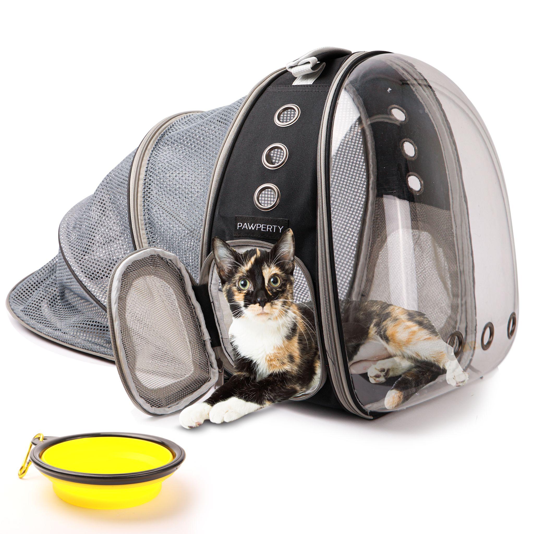
11. The cat is a perfect reference for this product, as it will make anyone who sees the image know that these are meant specifically to cater to cats. The design features a cat as the prominent image, which not only tells us this is meant for cats but also gives an idea of the product’s size.
12. The product’s images are designed to make it easy and straightforward for customers who might be unsure about which color they want. By providing them with three options within each image instead of just one color, we are making the process of buying smoother for the buyer.
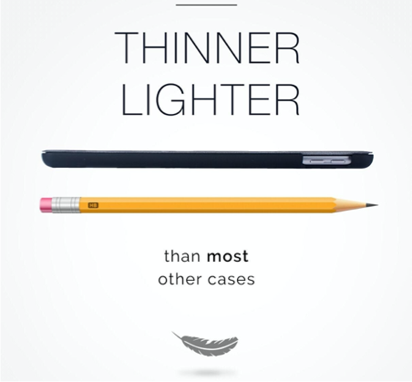
13. The careful and strategic placement of the pencil and feather shows how thin and light a product is. In this case, we see that placing two different objects next to the product is allowing users to notice some commonality between them–their weight and thinness. This is confirming customers’ awareness not only about these details but what makes the product special too!

14. These lamps in this room give it a warm and inviting feel. The product itself is used as an additional visual reference, but with two of them present, consumers are more likely to buy the set. Hence, Instead of just one, two lamps are installed. It’s interesting to see how two of them can create such an impact, while one would have been enough for most people!
15. The use of emoticons is a clever way to subconsciously associate your product with something that makes the customer happy. The thumbs up and heart emojis trigger an increased dopamine response creating a positive association between your product and better social media performance.
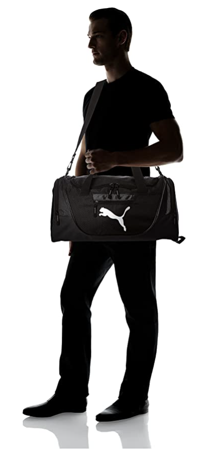
16. The inclusion of the male model provides both a visual reference for what your product looks like as well showcase how easy and effortless it will be to carry the product. The dimensions of the item are perfectly shown in this image. Also shows how it will look on anyone with more or less the same height and physique, making for an engaging experience.
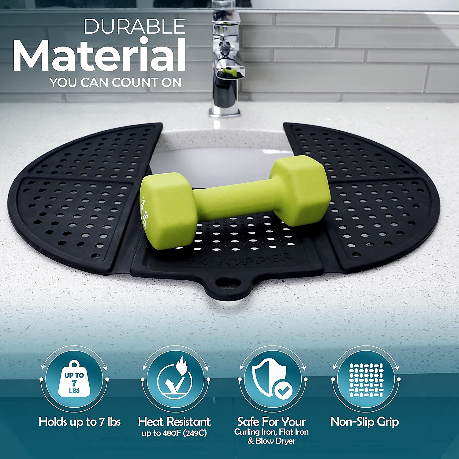
17. The above image is an example of how the image and text should work together to create a cohesive message. The image cleverly provides an aesthetics-based (dumbbell) representation of the durability being talked about in the text.
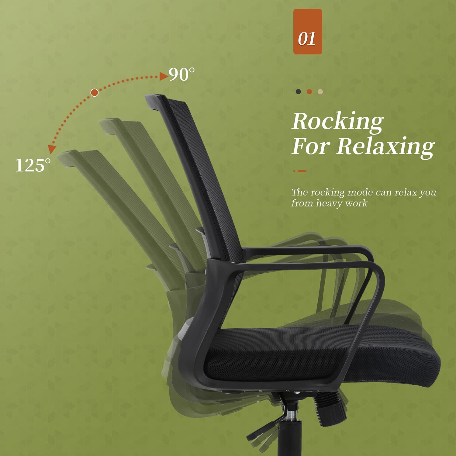
18. The image utilizes the motion blur effect which acts as a visual reference for customers showcasing how far back the chair can recline once the rocking mode is activated.
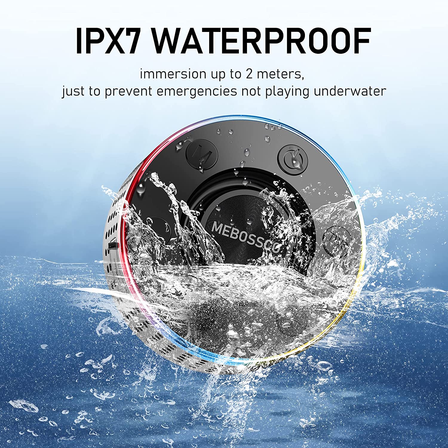
19. The visual representation of the splash of water onto the device helps put into perspective its waterproof construction, making it clear to the buyer at first glance even if they don’t read the text.
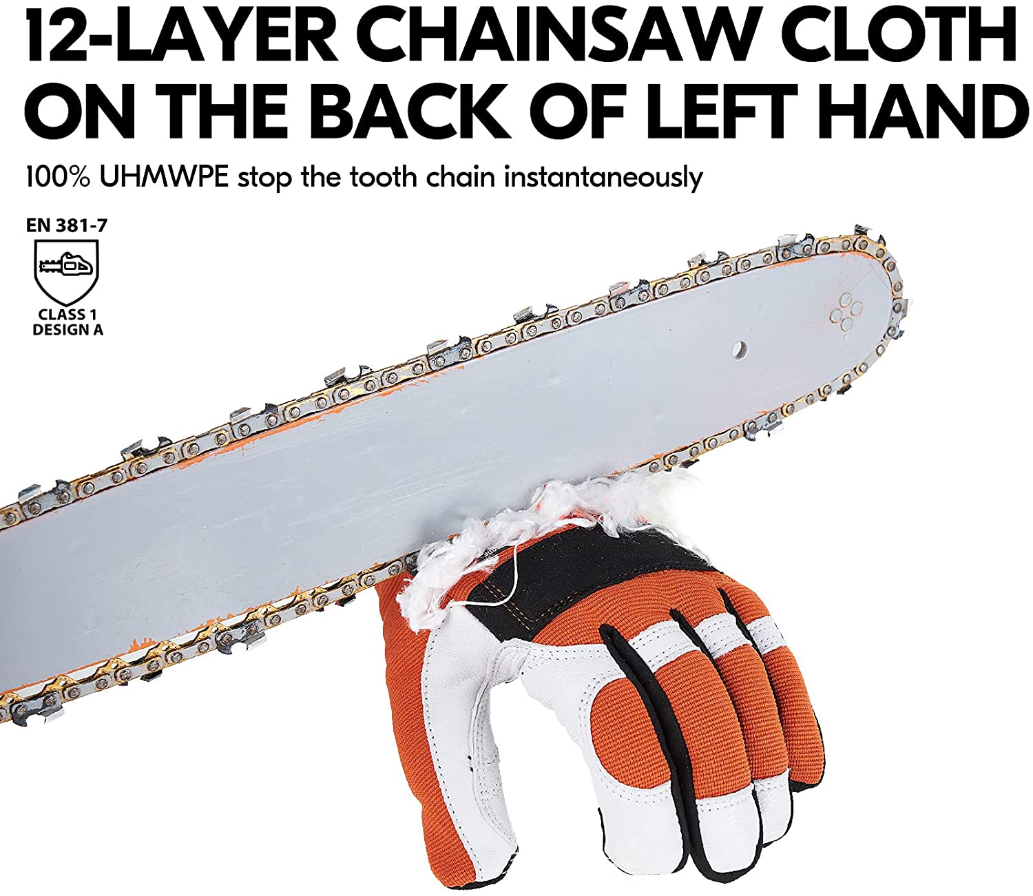
20. The chainsaw in the above image provides a clear and concise visual demonstration of how the 12-layer construction will keep the back of the left hand protected at all times.
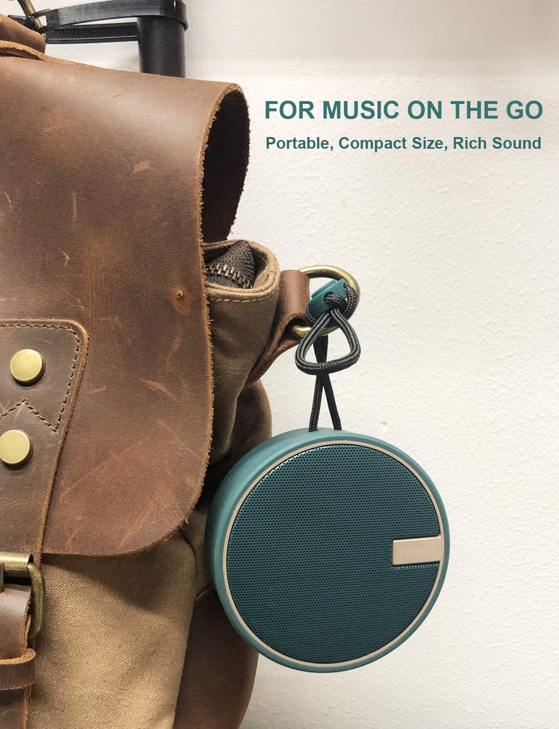
21. The bag’s brown leather and rich color are not just for aesthetic purposes. It has been carefully chosen so as to associate the material with the high-quality sound production of the speaker. It is also simultaneously also showcasing its compact and portable size.
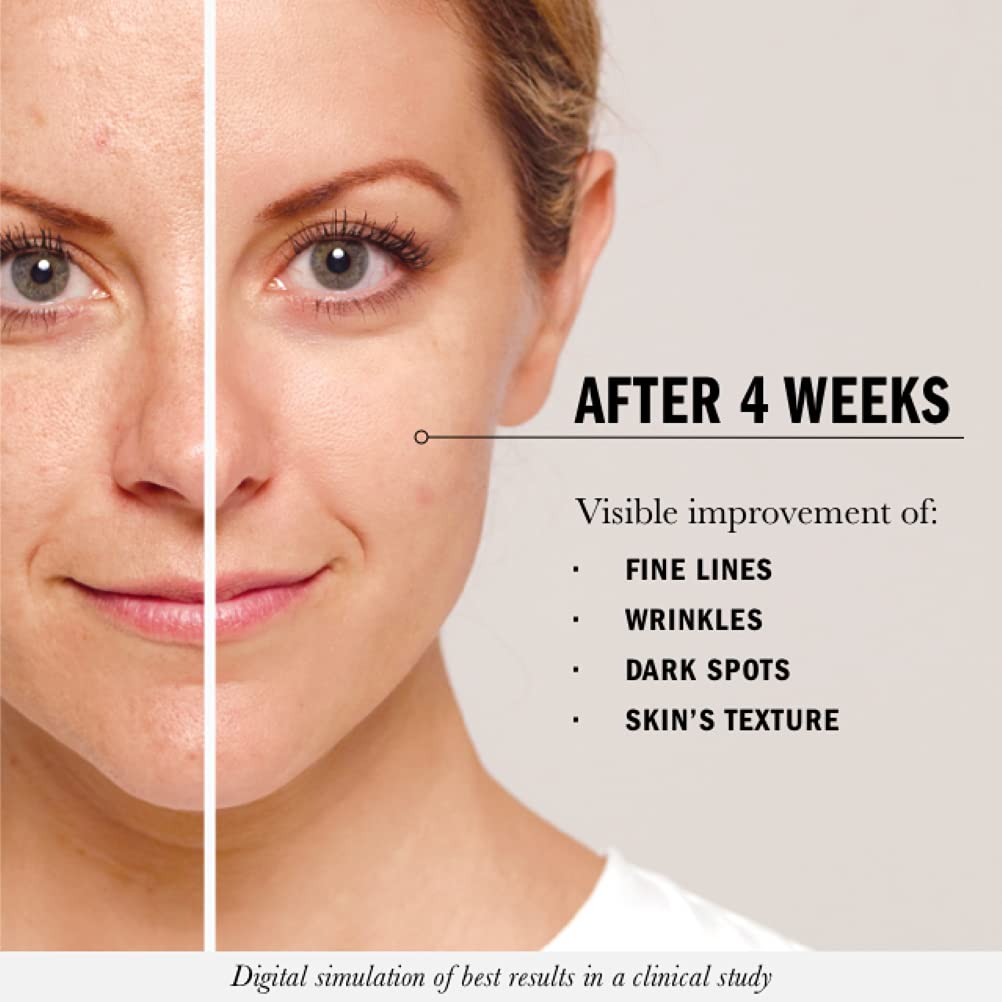
22. One of the most used and effective visual reference images especially when it comes to beauty products and cosmetics. With one side showing the effects of aging on the skin, and another highlighting how effective the specific product can be at correcting them.
23. The can of the drink is a visual reference, showing size in an intelligent and creative way. Users will know right after seeing this image that it is a small-size product with portability being forefront on their minds! Additionally, white backgrounds are so effective at drawing the eye. They help human viewers focus on what’s important in an image.
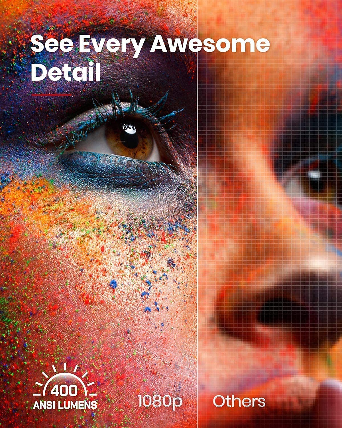
24. In the above image, the projector’s high-definition clarity is brought to life by the use of pixels on one side, which provides a visual reference for how clear and detailed this image created by the projector is in comparison. Basically, the before and after image shows the distinguishing feature of the product as it shows the difference in the quality.
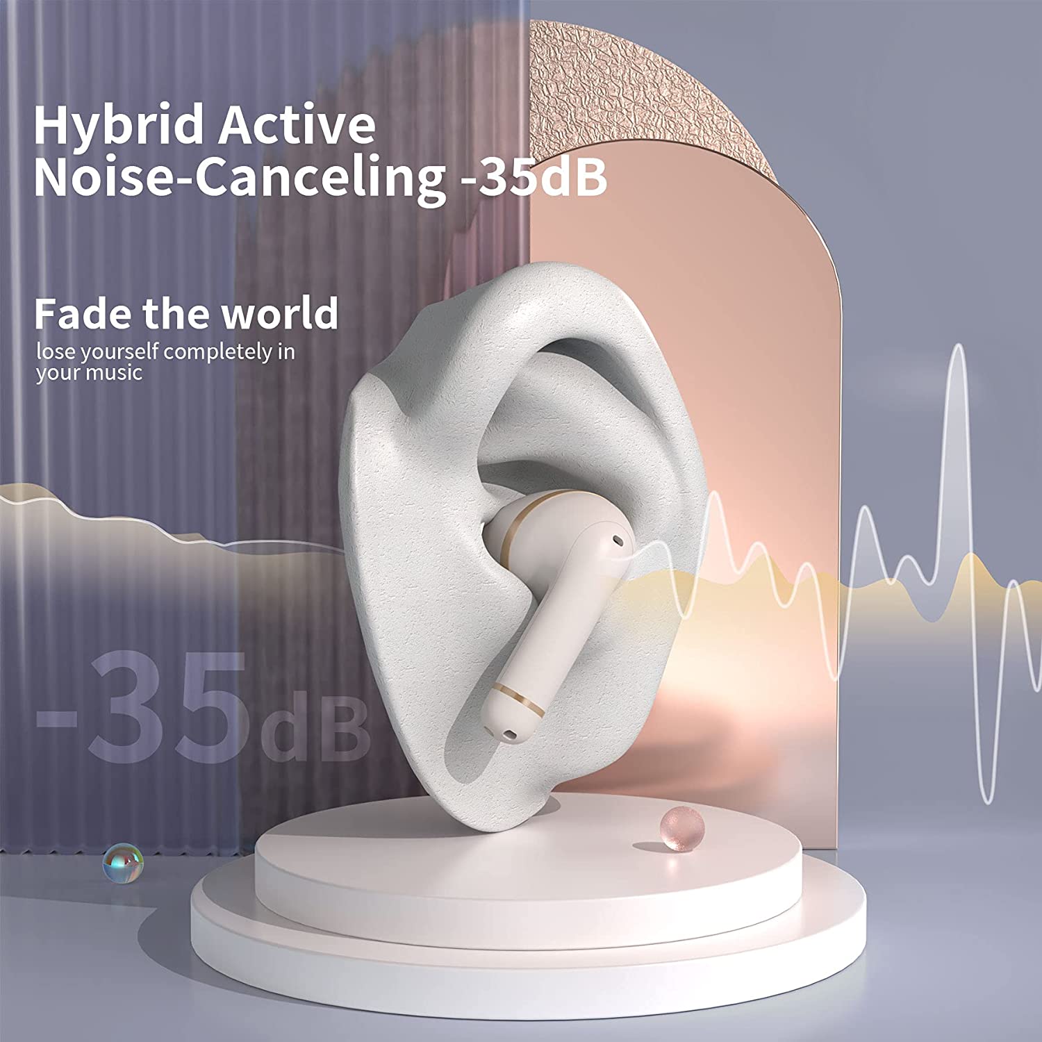
25. This visual guide of the ear shows how it fits in perfectly without falling. With clever use of the visual sound wave, the image is able to visually represent the noise-canceling capabilities of the product. This instantly catches the attention of the consumer at first glance.
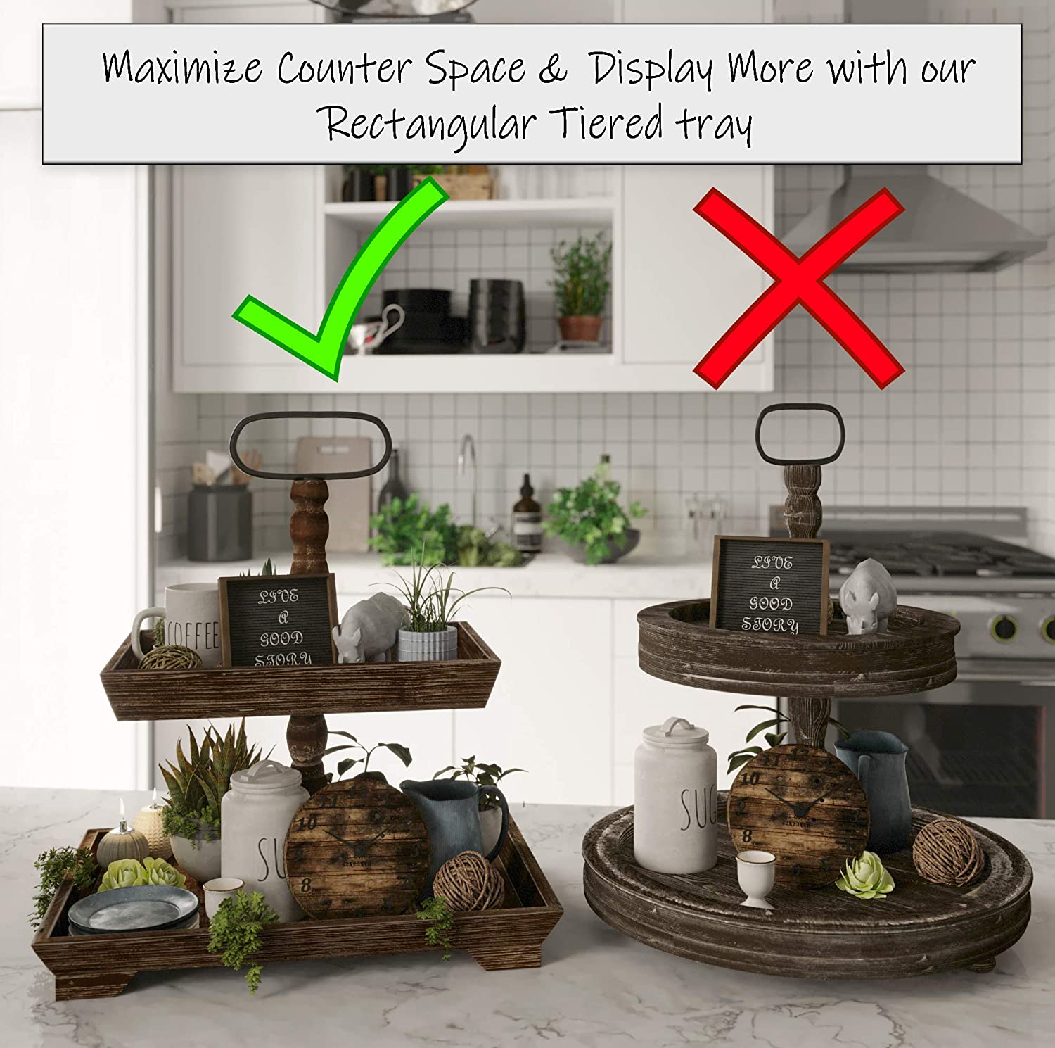
26. The more surface area a product has, the easier it is to use and fill. A rectangular shape with more surface area of this particular item makes for an excellent experience in every aspect! By putting the product directly next to another similar product, it becomes easier for consumers to compare and see exactly what benefits or value that particular item may add to their life.
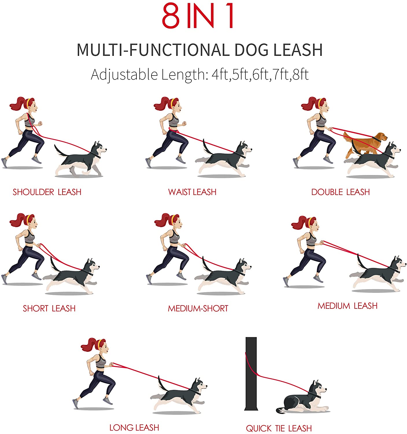
27. The many different uses of the dog leash are innovatively made clear with the help of illustrations. The clever use of illustrations not only provides a visual reference of each use but helps present it in a way that is easy to understand.
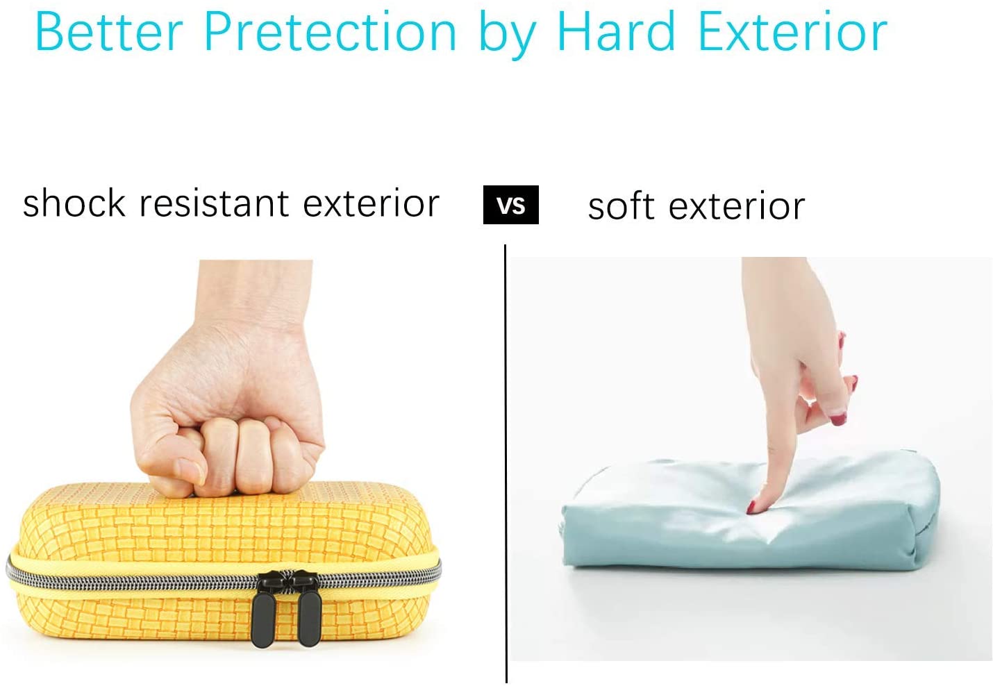
28. The juxtaposition of the two images in one creates a powerful visual reference for the consumer that showcases the durability and strength of the product. The image is made more impactful due to contrasting visuals of the closed fist in comparison to the single finger.
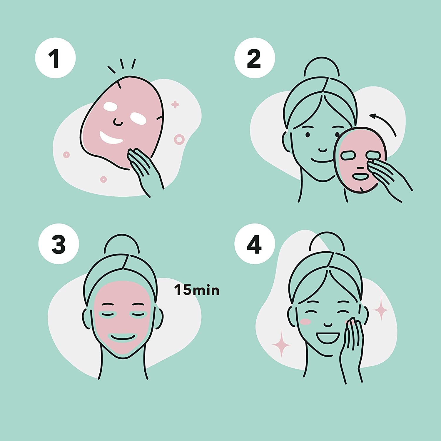
29. This image simply illustrates the steps of how to use the face mask. Each step is represented by a simple number, making the instructions easy to understand and follow even if the person hasn’t used a facemask before.
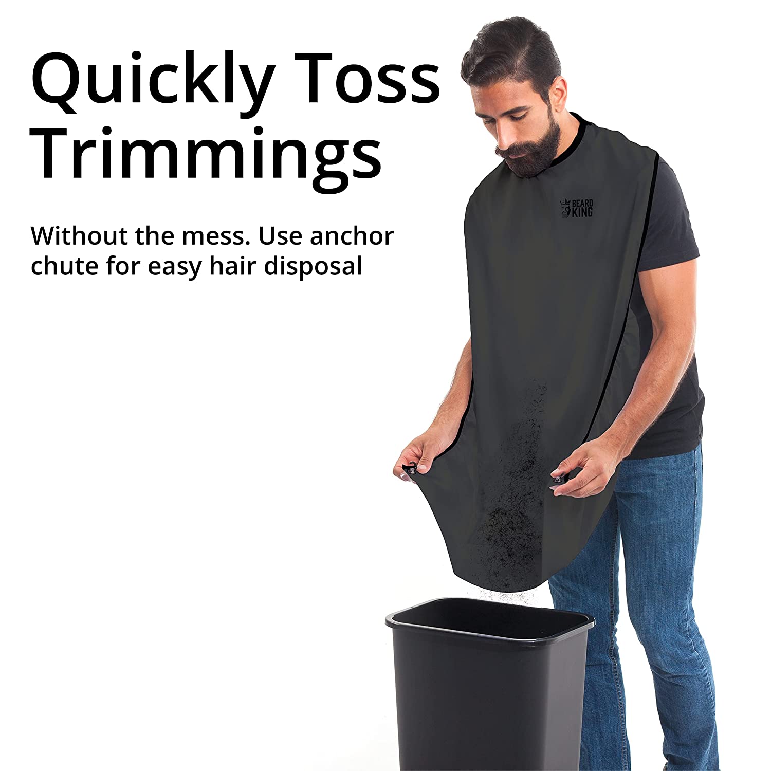
30. The anchor chute is an easy way to dispose of hair. This visual reference image demonstrates how it can be used efficiently and conveniently! At first glance, the image might only seem to show the product being used as intended but removing all backgrounds and using only white space instead visually creates a sense of how this product will help them remain mess-free.
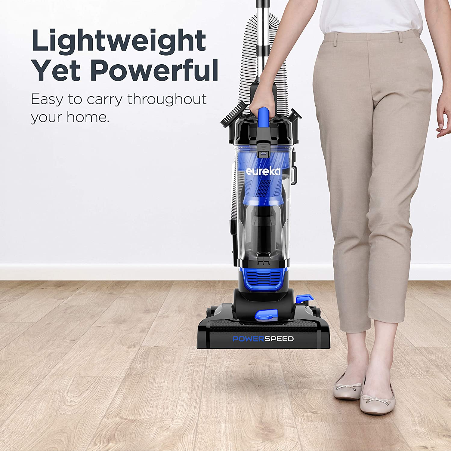
31. This image shows a variety of different colors. Users can pick any color they want to! It cleverly shows the colors changing from red to green in sequence, making it easy for customers who are trying not just to see but also understand how each color will look.
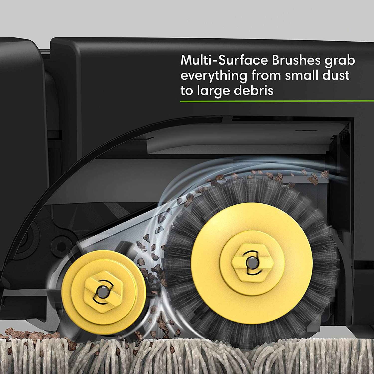
32. This image provides a visual reference of the 3d inner view of mechanics that are involved in order to help the machine work. The use of certain effects visually shows the different parts in motion allowing for an easier understanding of how and why the machine works. It shows how easily its threads brush off even the minute and smallest dust particles.
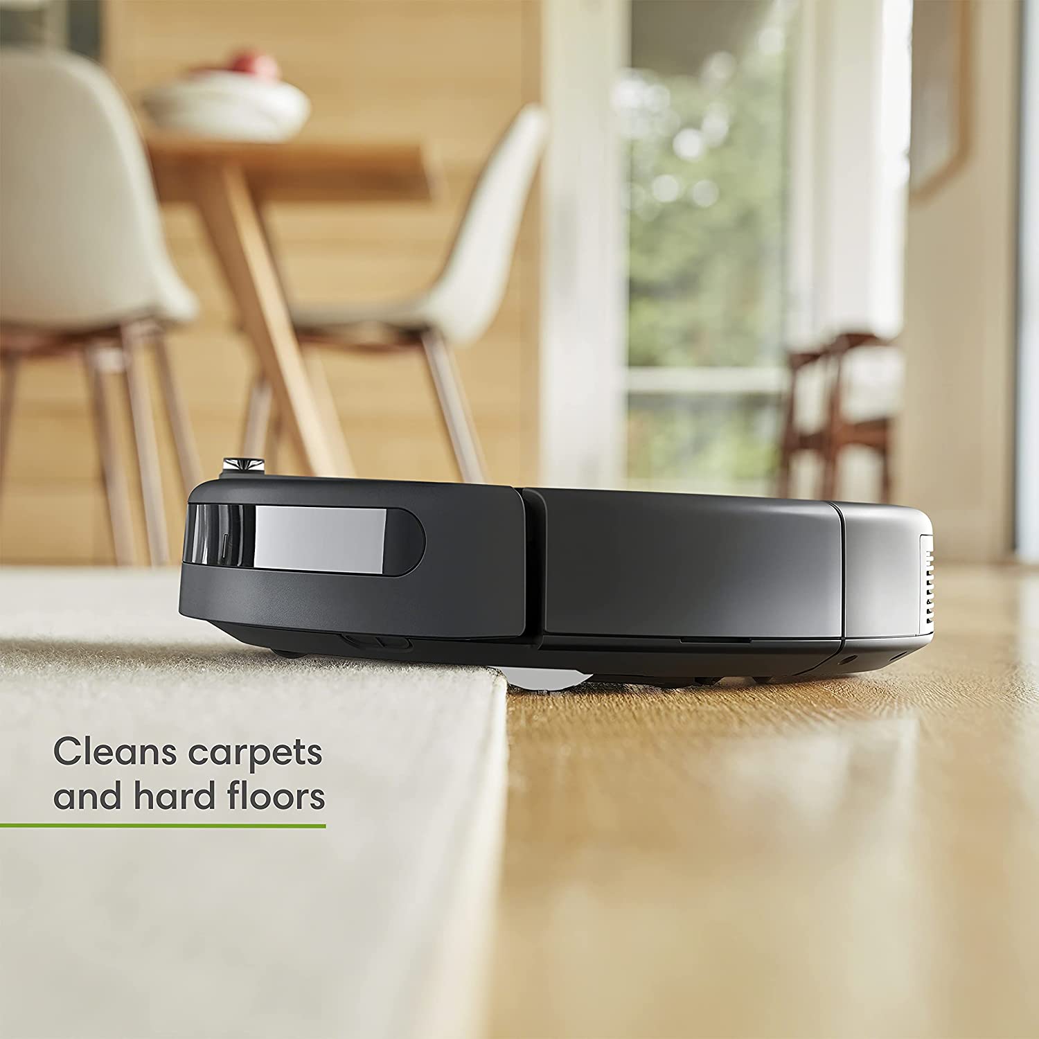
33. The simple yet cleverly placed product between the two surfaces visually references how it is effective on both carpets and hardwood floors. While also providing a reference for how it will look in a household setting with one or both types of floors.
34. The strategic position of the product in the middle of the before and after image not only makes the stark difference between the left and right image more prominent but also visually represents that the difference between them is that of the product itself.
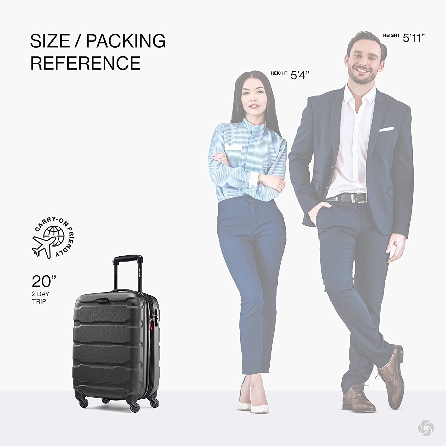
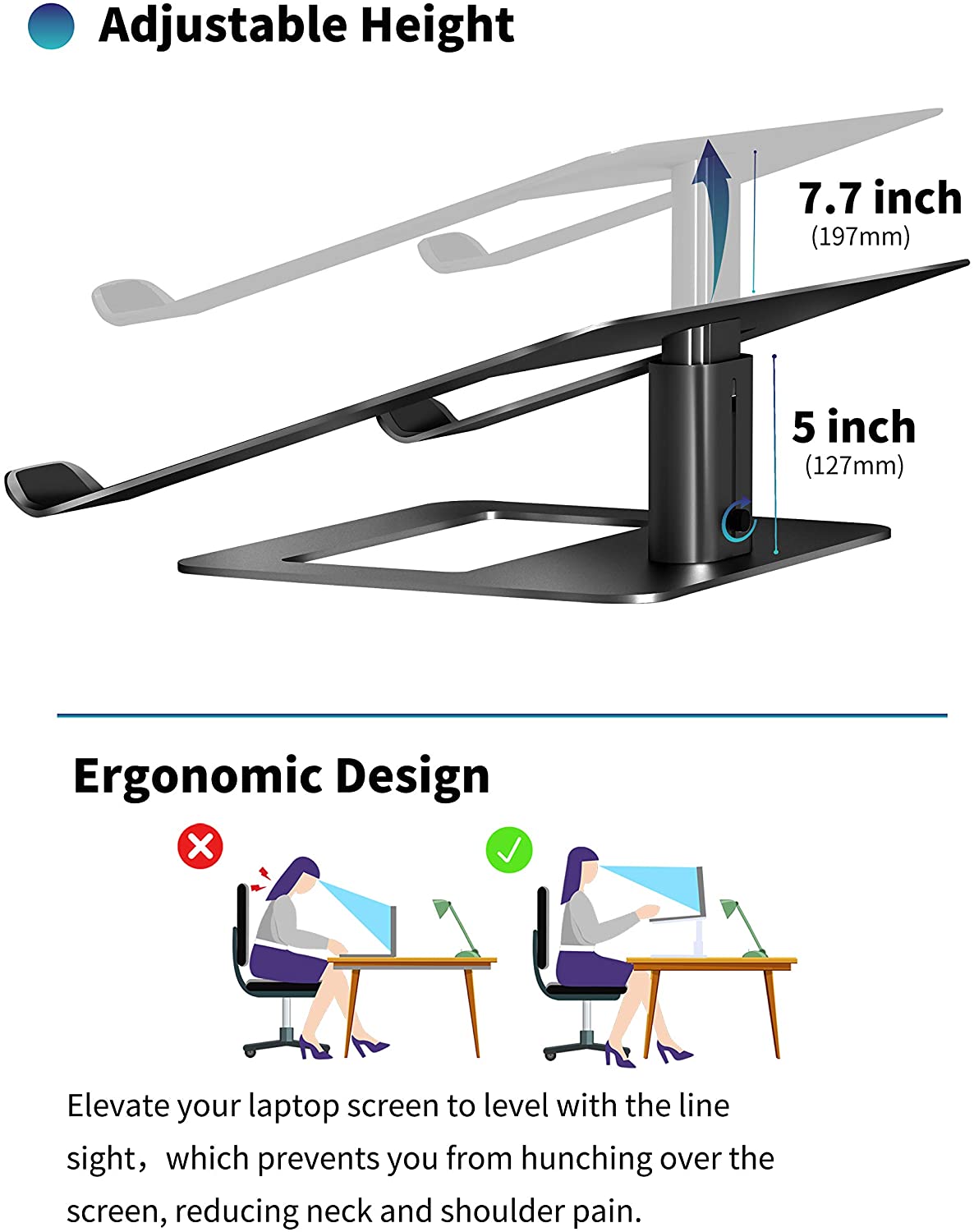
35. The inclusion of the two models with their heights mentioned on the top corner helps create a visual scale reference that allows consumers to grasp size. Just by noticing the heights of respective models, potential buyers can get an idea about the size of the product.
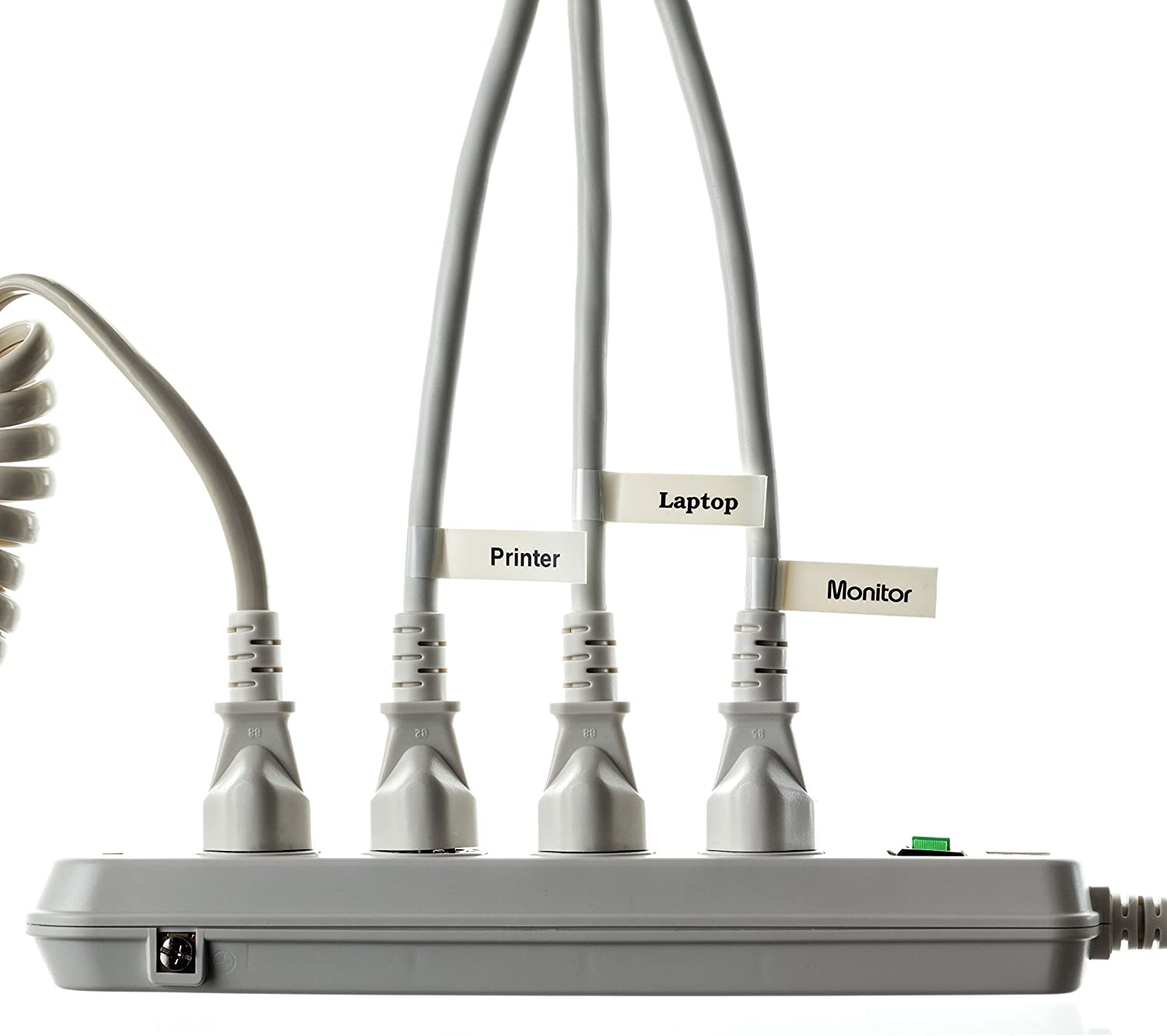
36. The clearly labeled wires help create a visual reference showcasing the cable organization capabilities of the extension board for your computer table.
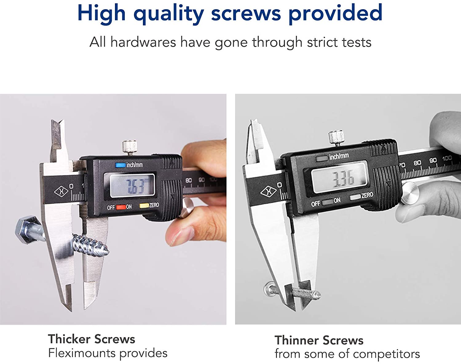
37. The two images of screws next to each other make it easier for the viewer’s eye and brain, as they compare them side by side. The quality difference becomes more evident because of the size of screws and visible reading on the measuring tool.
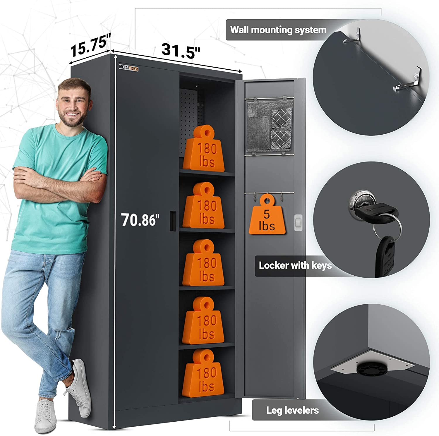
38. By presenting the weight capacity of each shelf in the form of a heavyweight block. These blocks are used as a visual reference to let the consumer know how much weight each shelf can hold. Additionally, the comparison with the height of the model also clears out the confusion any buyer has regarding the size of the product.
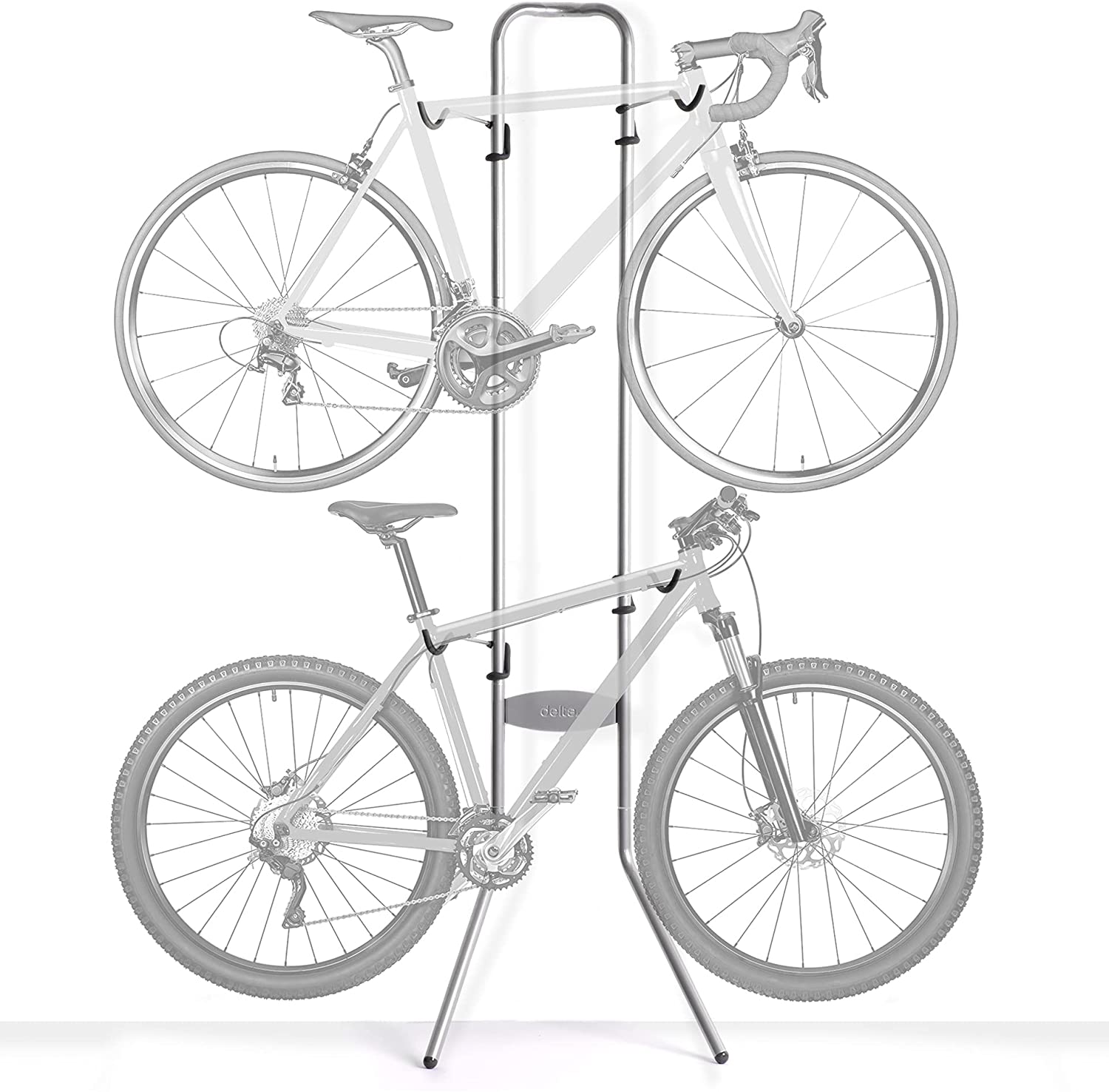
39. This visual reference shows that the bike stand can hold more than one bike. The image perfectly highlights the practical use of the stand by showcasing balanced and neatly stacked bikes. Its symmetrical representation evokes an aesthetic sense.
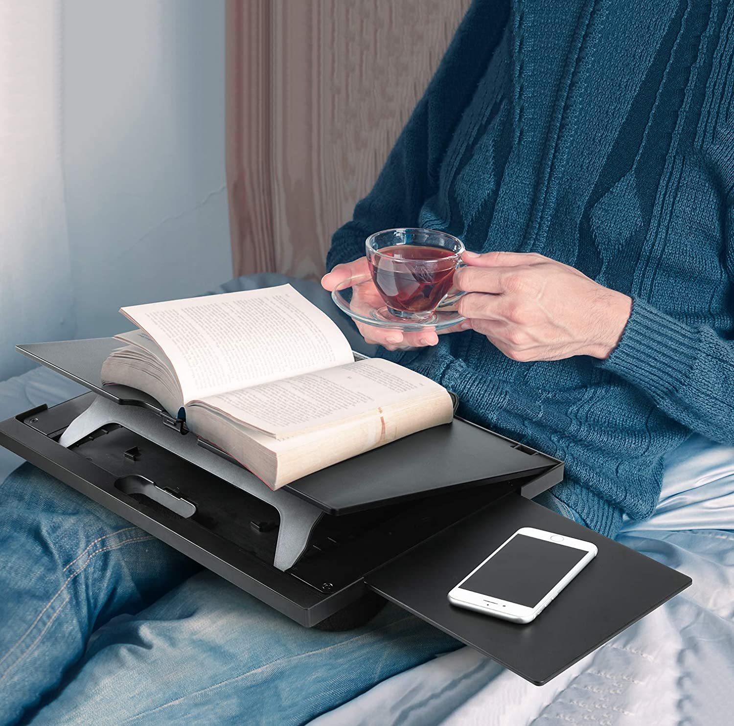
40. The in-use shot of the product is a powerful way to show real-life settings as its reference for what customers can expect from that specific item. The visual cues help them learn how the said product will look and function before they make their decision.
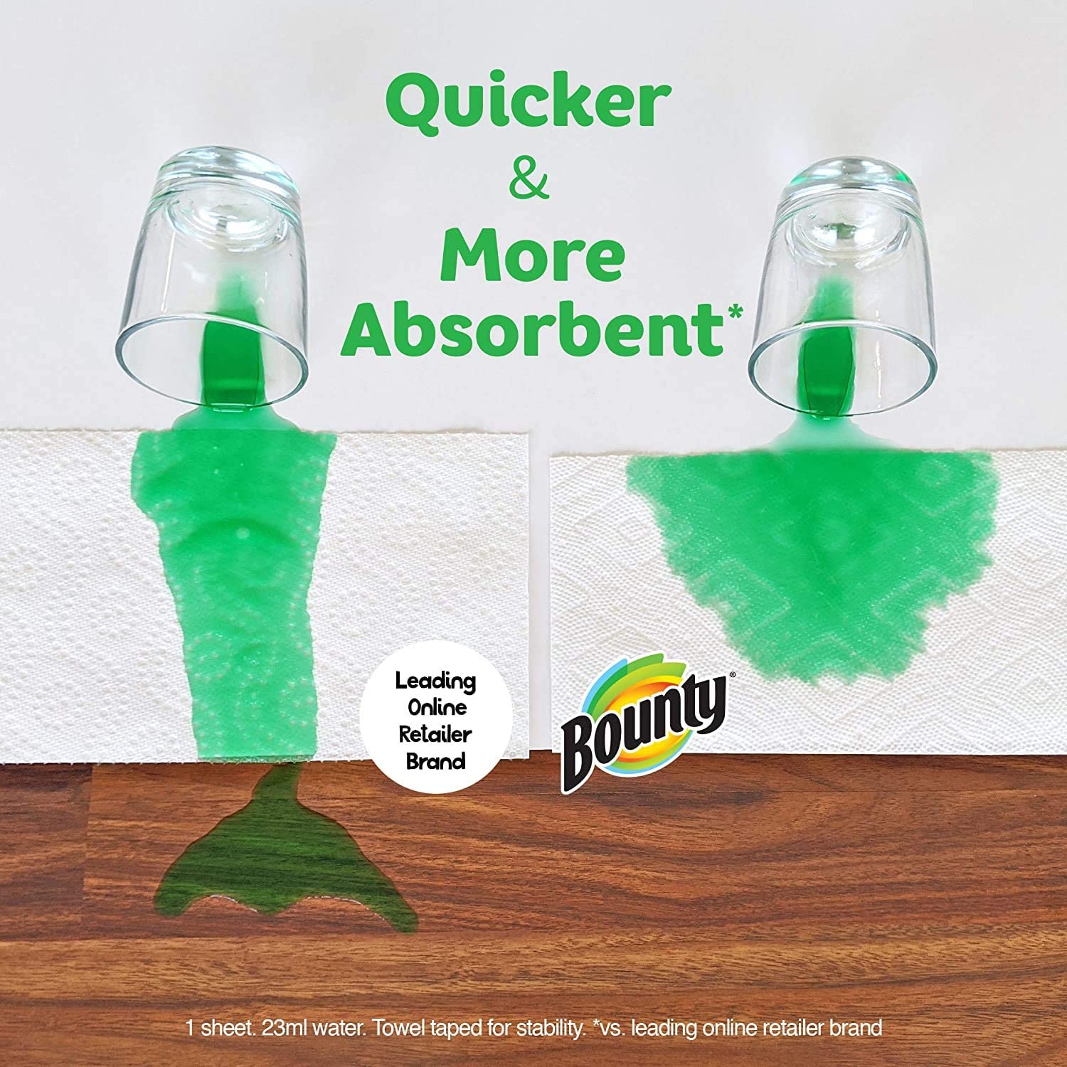
41. If the absorbency of the particular product was shown on its own, it would not work as well; however, by putting it next to another similar item you can see how much more absorbent the product is in comparison!
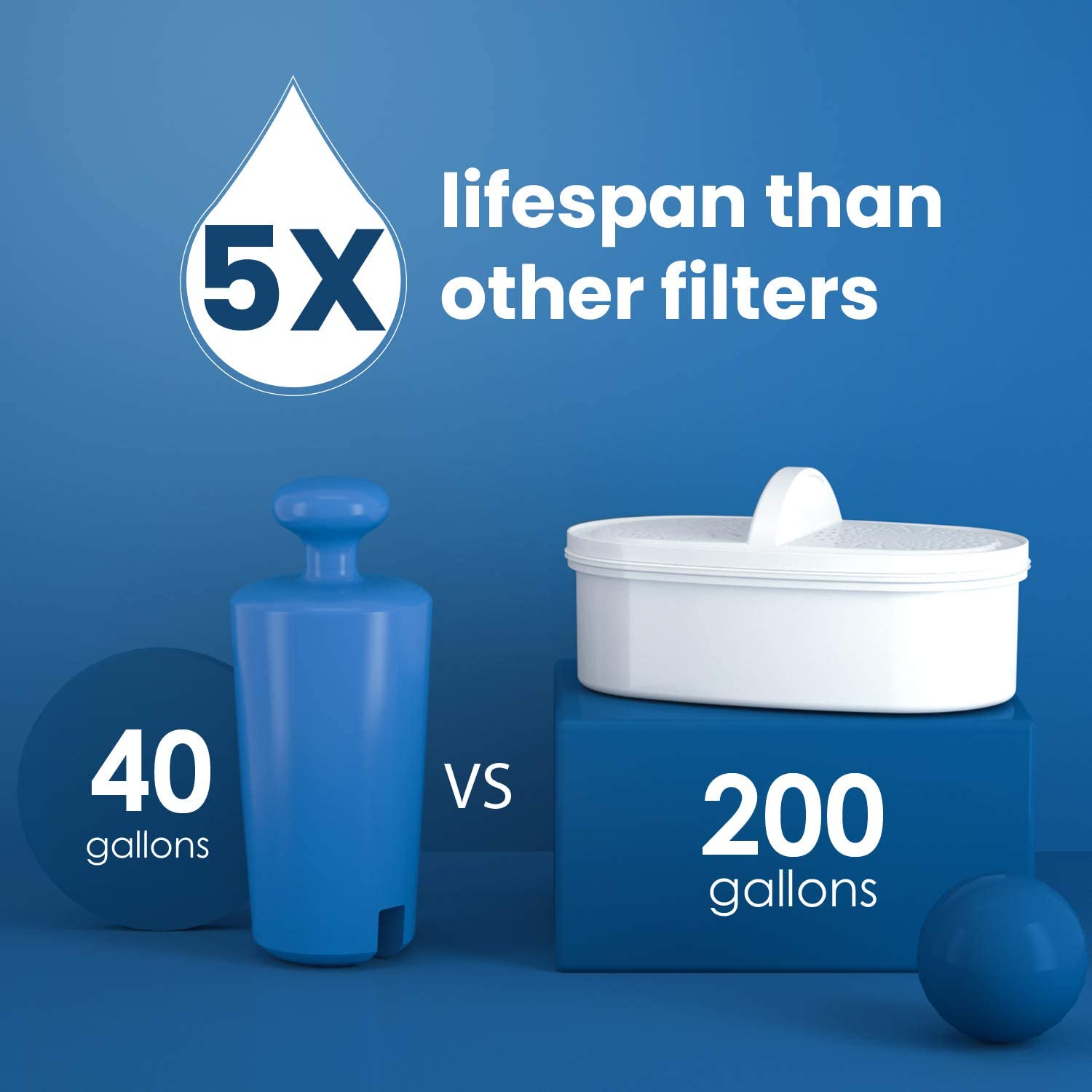
42. In some instances, the text is the main visual identifier in an image. Just like above with numbers next to each filter acting as a reference for how much water can filter through before it becomes too filtration-heavy.

43. The visible do not use sign on top of the other cleaning supplies helps create a visual understanding that this product can be used as an all-in-one solution for your daily needs.
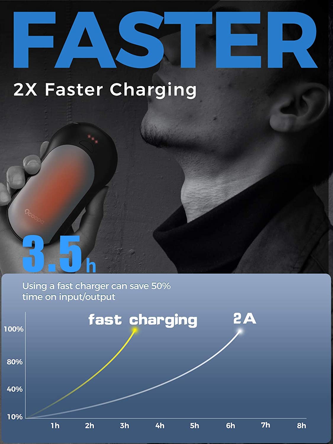
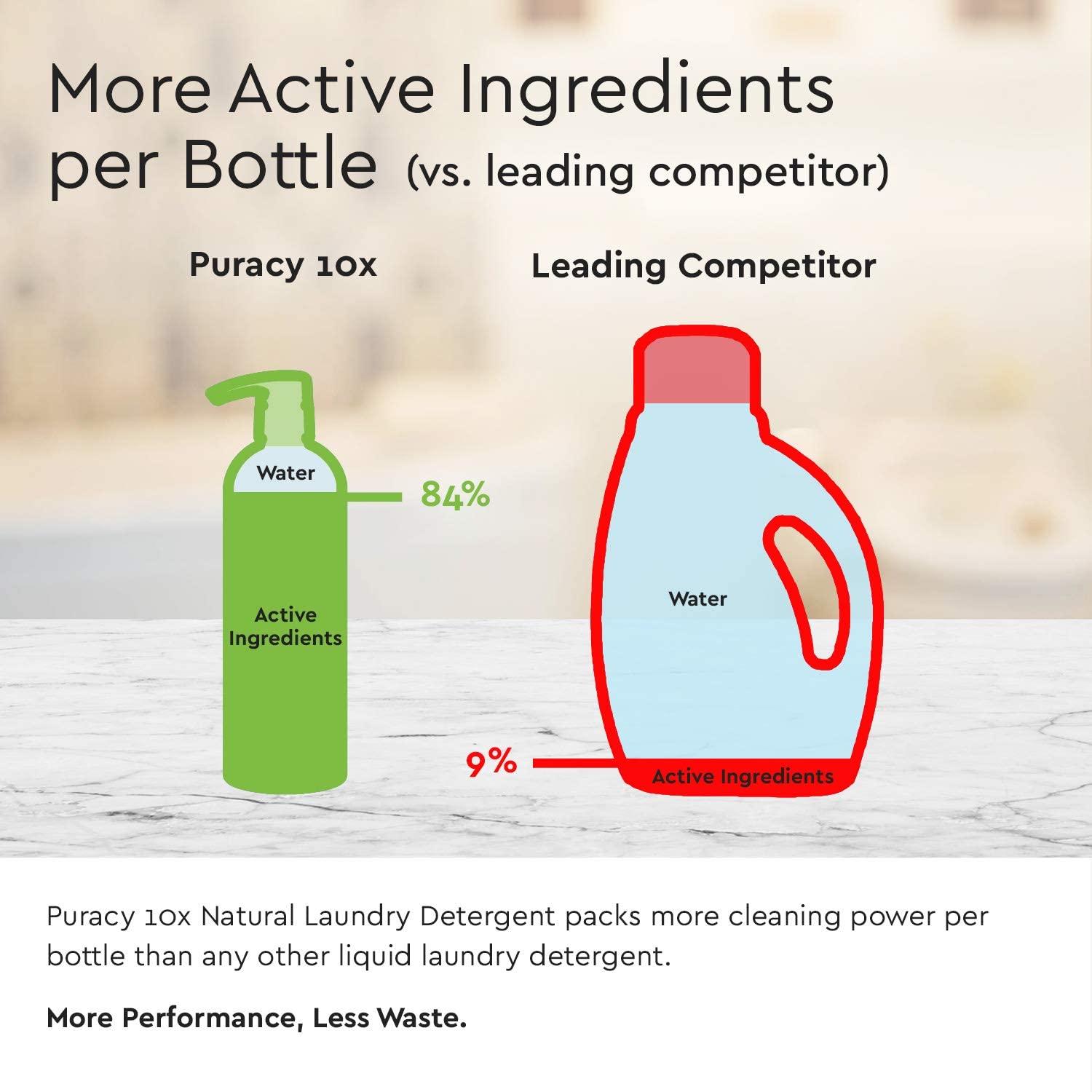
44. The statistical charging graph is used as a visual reference in this infographic to show how quickly the charger charges while also simultaneously comparing it with an ordinary 2A scenario.
45. This visual reference shows products on different skin tones, so anyone can have an idea whether the product would go with their own or not. The multiple skin tones in this image act as a visual reference for buyers who want to see how the color might look with their own skin color.
46. One look at this image and you can see that the vacuum is lightweight. This feature is visually represented by showcasing the model carrying it with ease using only one hand.
47. The ability to use just the silhouette of one’s competitor and showcase their own product over it is a great strategy. We can see that this is a brilliant way of showcasing one’s own product and highlighting its benefits over the silhouette.
48. The more information you provide to your customers, the better! Actions showing the right use of the product is likely to help customers in making a purchase. Information about how customers can use a product more efficiently is important in increasing your conversion rates.
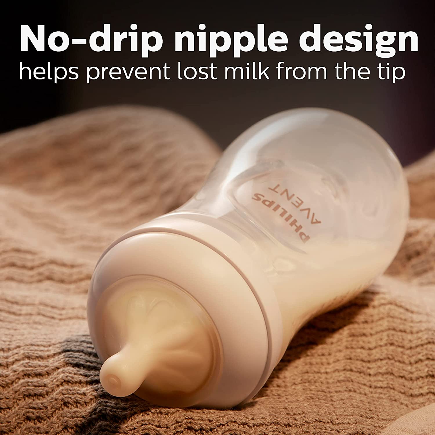
49. Showing a shot of the filled bottle knocked down visually helped showcase the non-drip feature of the design. The clever technique helped provide a visual reference showing its effectiveness against accidental spills.
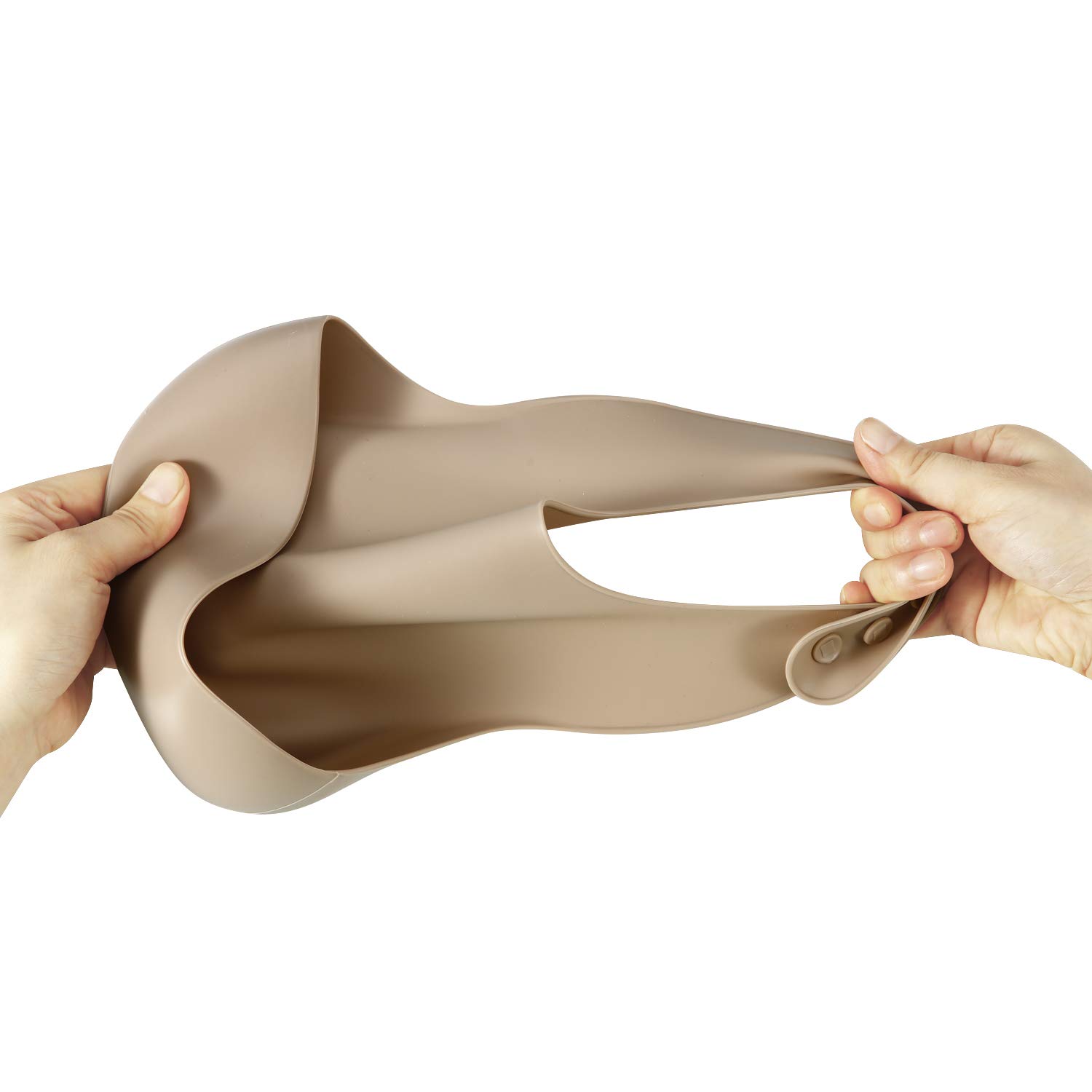
50. The clever shot provides an accurate visual reference demonstrating the flexibility of the silicone baby bibs. Moreover, the product shows how deep is the bib’s pocket at the same time, making it easier for the customer to understand flexibility, durability, and the bib’s capacity to hold spills in one picture.
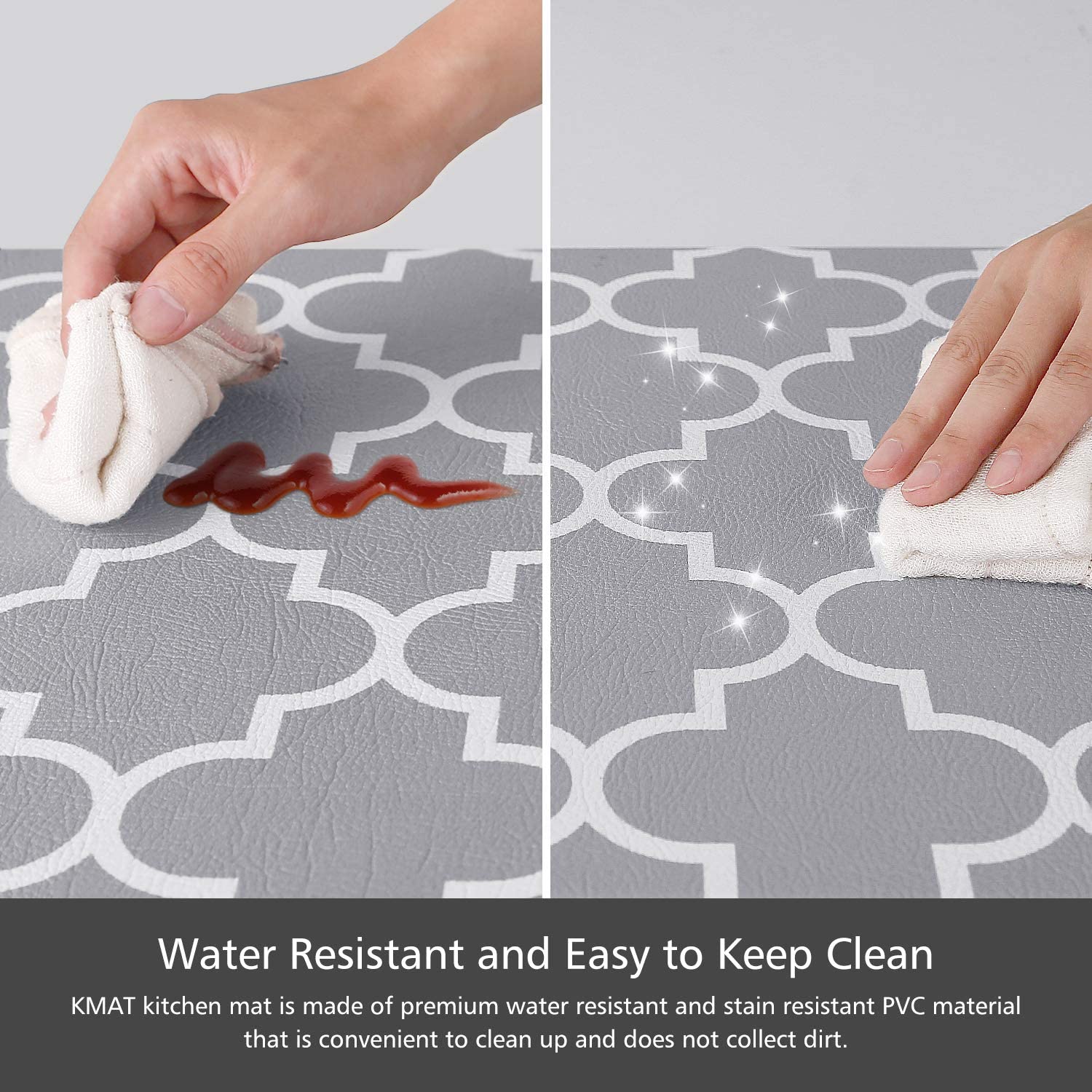
51. The before and after shot shows the product in action. While the ketchup-colored stain provides the necessary visual reference to let the buyer know how the product can clean even the toughest of stains like ketchup.
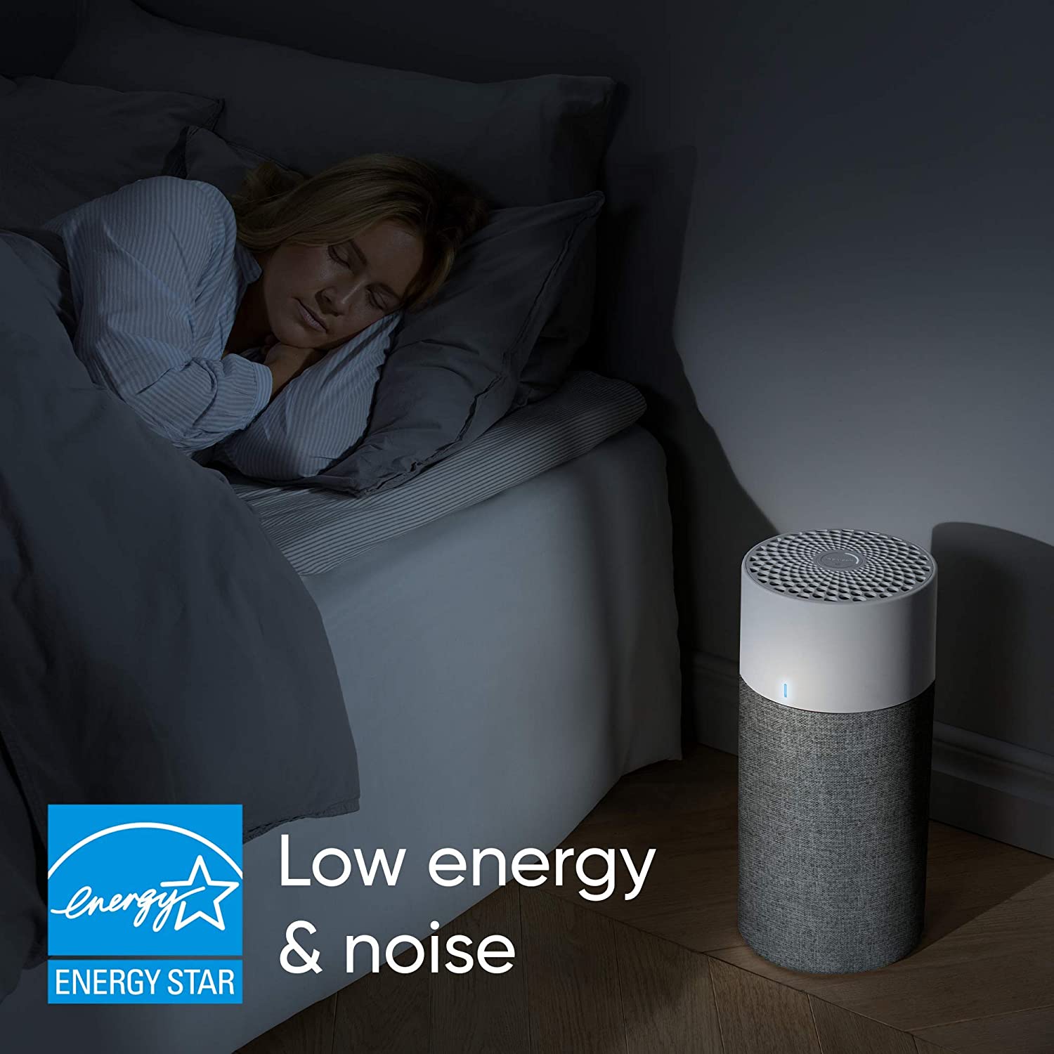
52. The image of the model sleeping peacefully while her machine is visibly turned on provides all visual references needed to deduce that it will not disturb your nightly sleep.
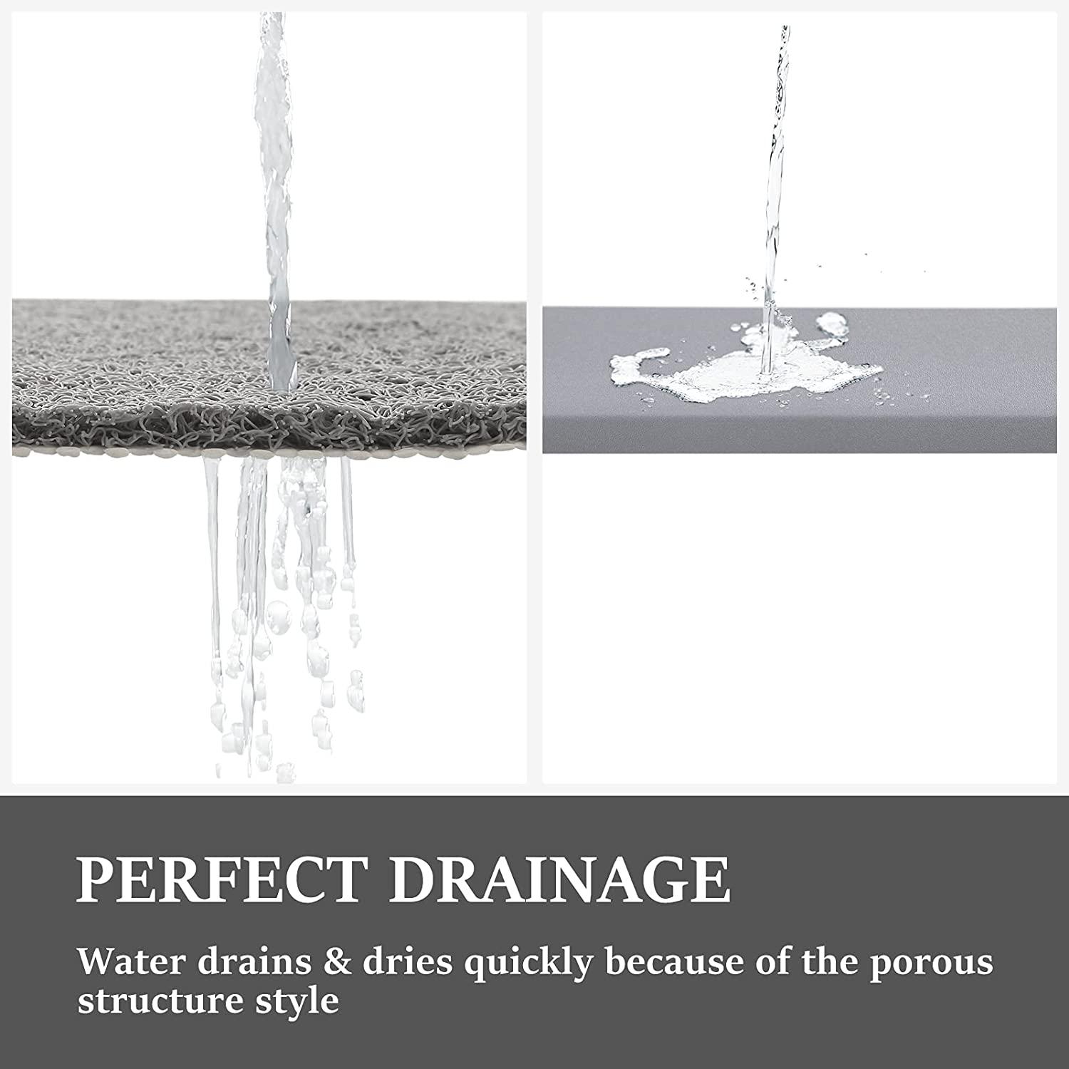
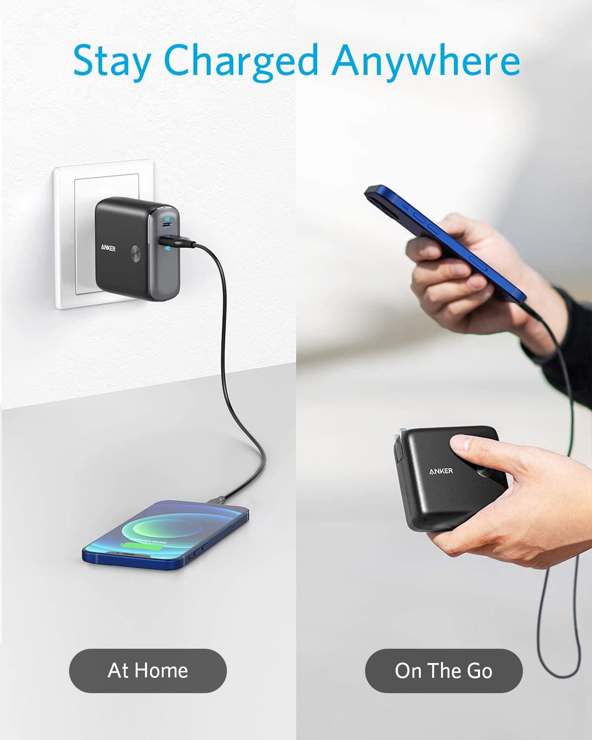
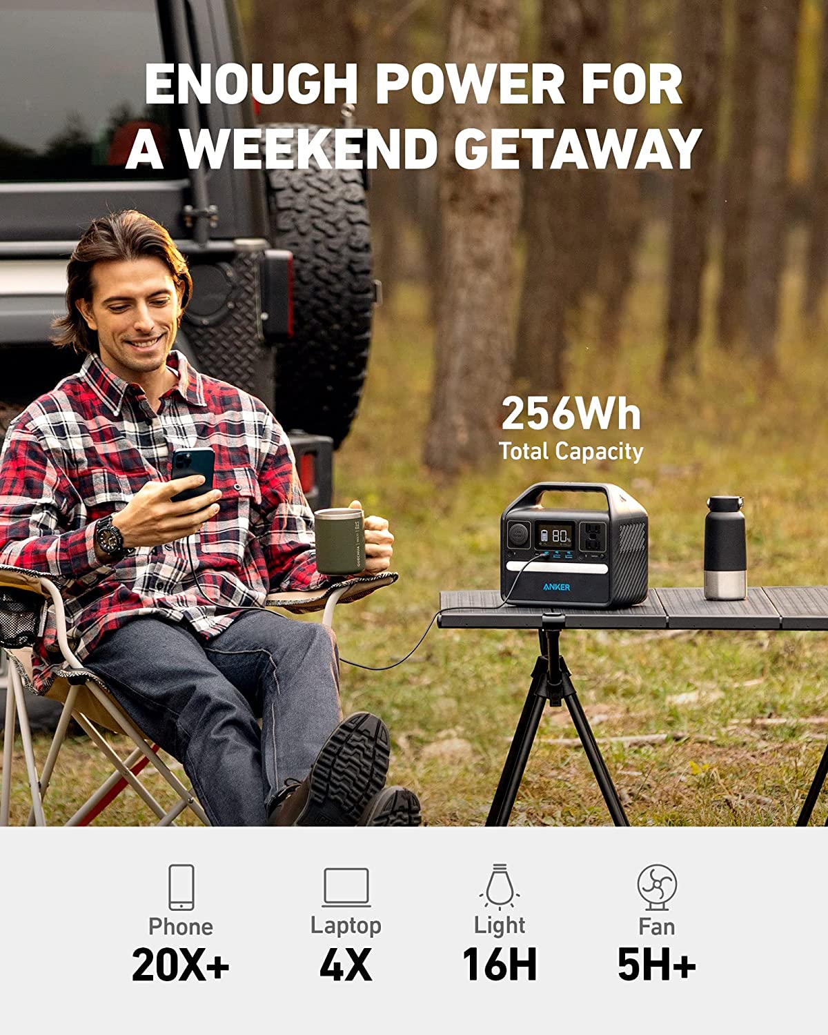
53. The comparison image provides all the necessary visual references showcasing how the porous structure allows ideal drainage instead of letting the water pool up like on the other products.
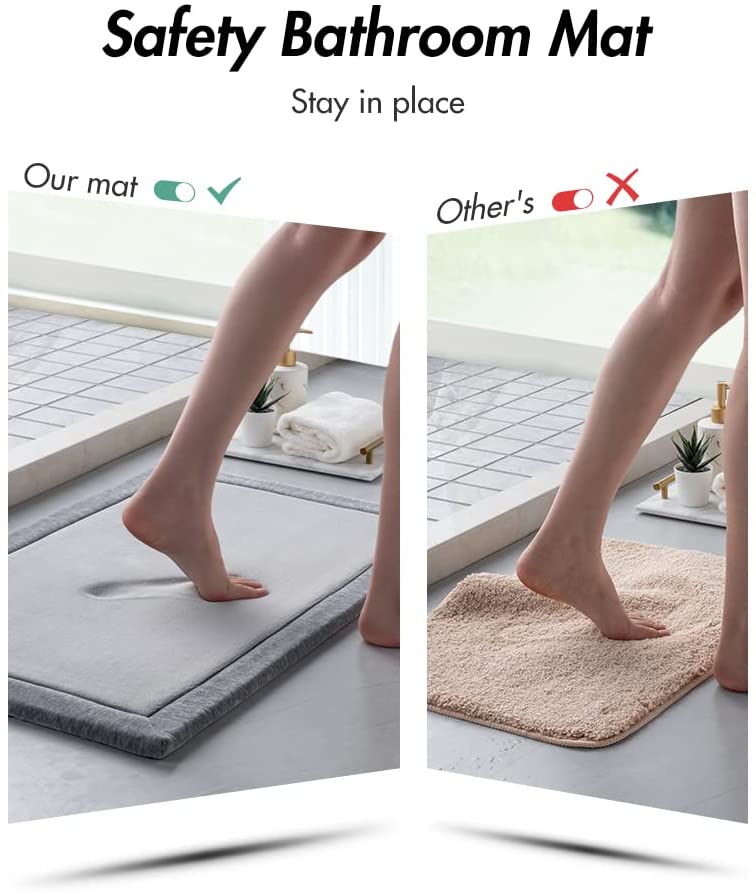
54. The visually engaging comparison shows how our product remains stable while the other mat moves, providing a clear visual cue that points out potential danger.
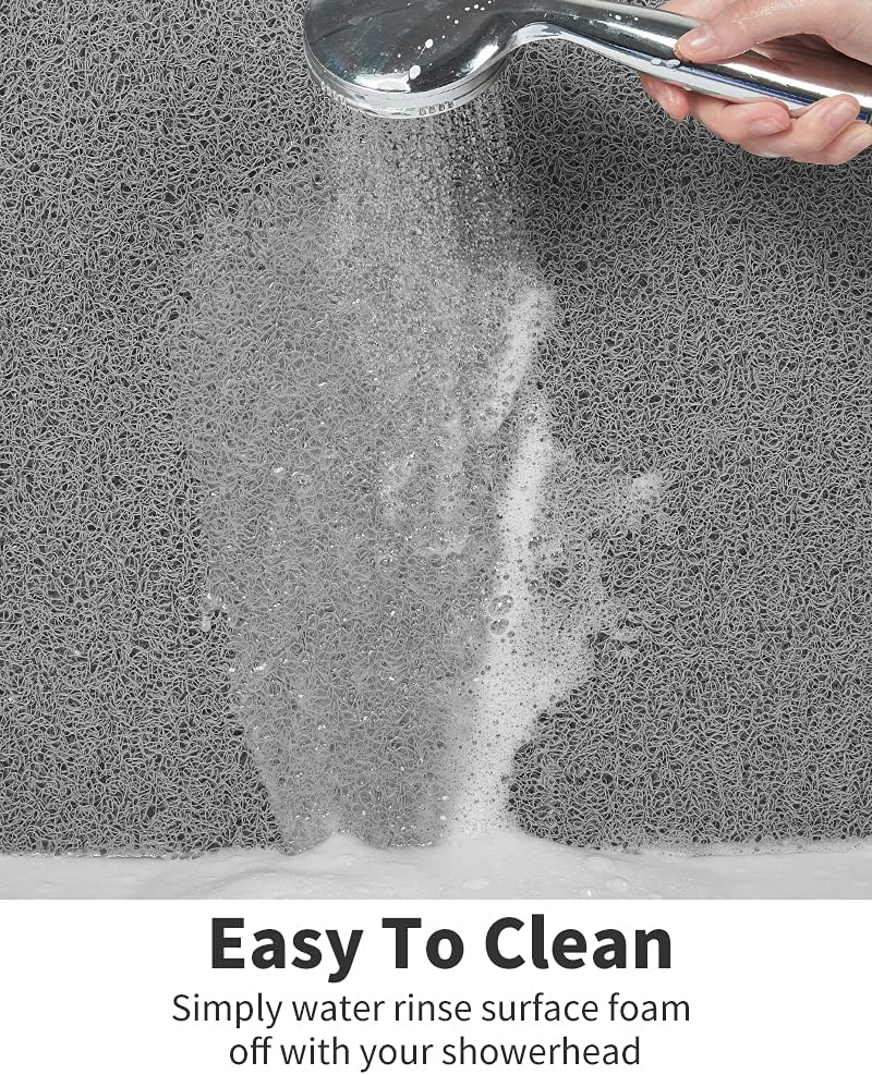
55. Instead of simply telling the buyer how easy it is to clean the bathroom mat, this photo provides a visual reference by showing the hand-held shower head being used to show exactly how easy it is to clean.
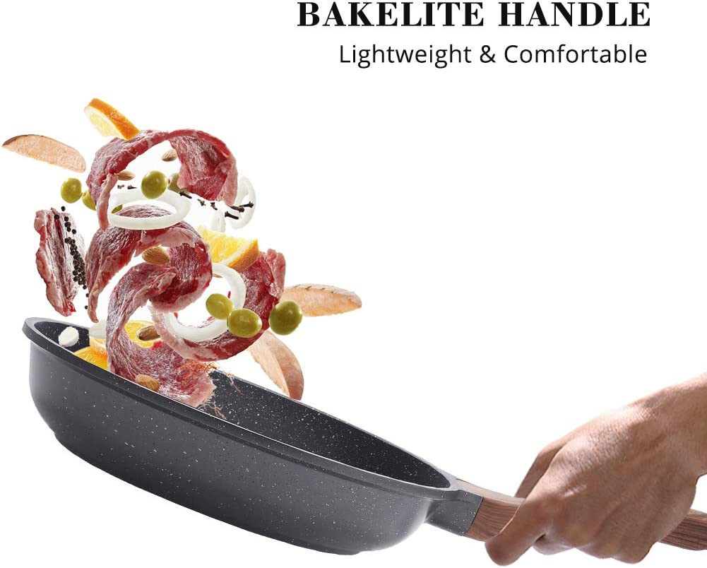
56. The shot of the food being tossed in a pan provides enough contextual clues to let buyers know how lightweight the construction is with a visual reference that shows them what they can expect.
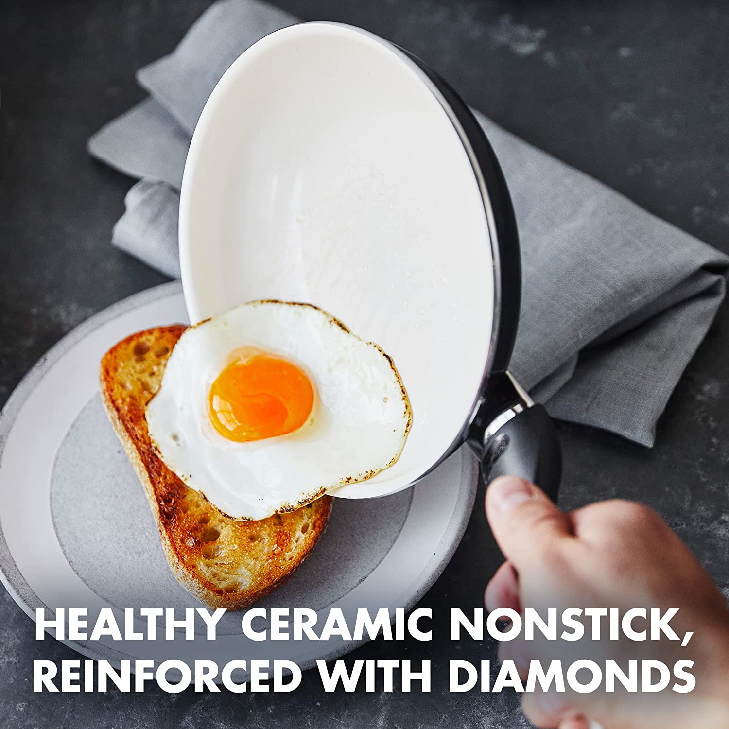
57. The image of the sunny side-up egg being slid down the pan acts as a visual reference for how easy it will be to clean the non-stick surface. The use of this image also makes sure customers know what they can expect from their new product, even without using too many words!
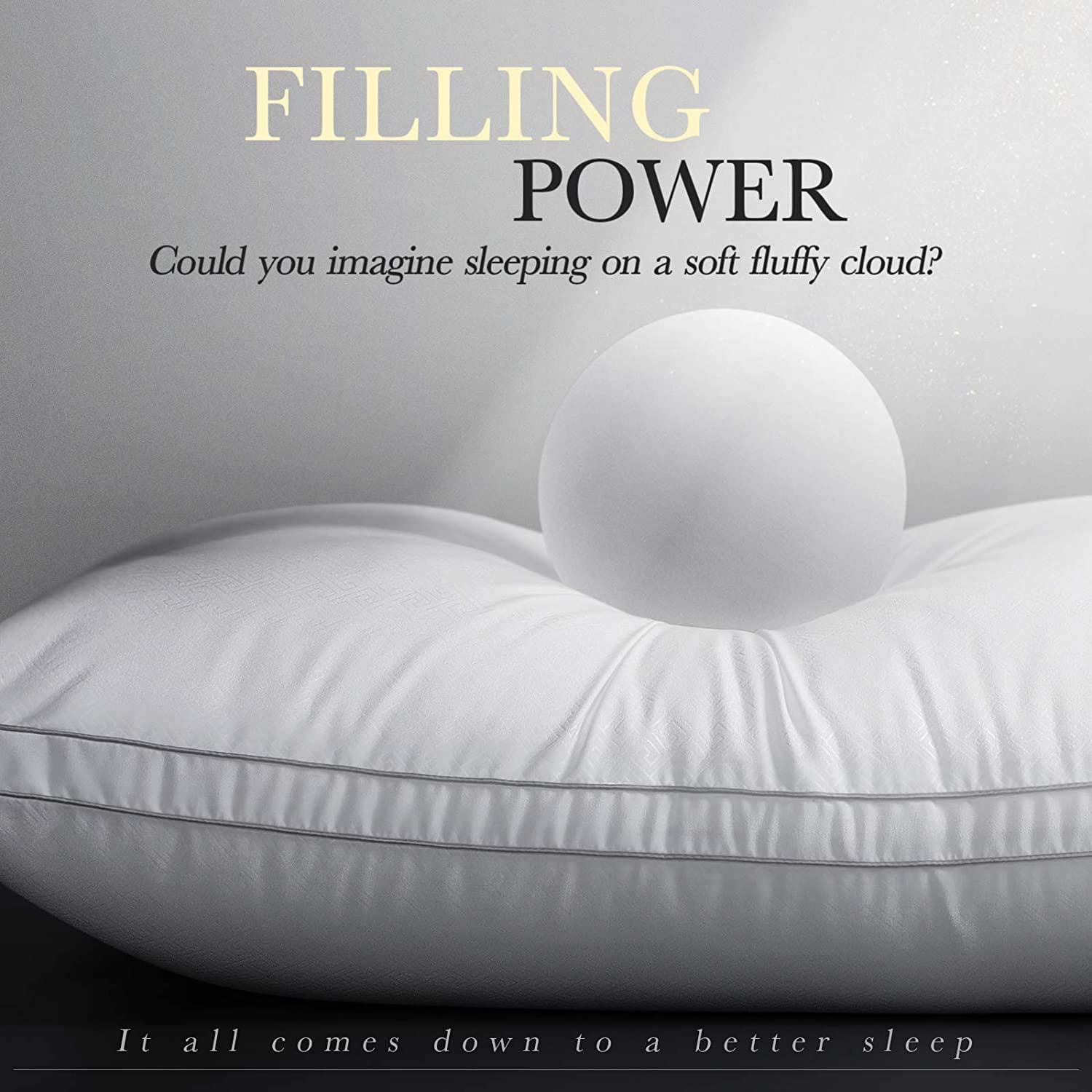
58. The orb placed on the pillow in the image acts as a visual reference showcasing exactly how fluffy yet dense the pillow is. It makes it easier for the audience to imagine a resting place as soft as a cloud.
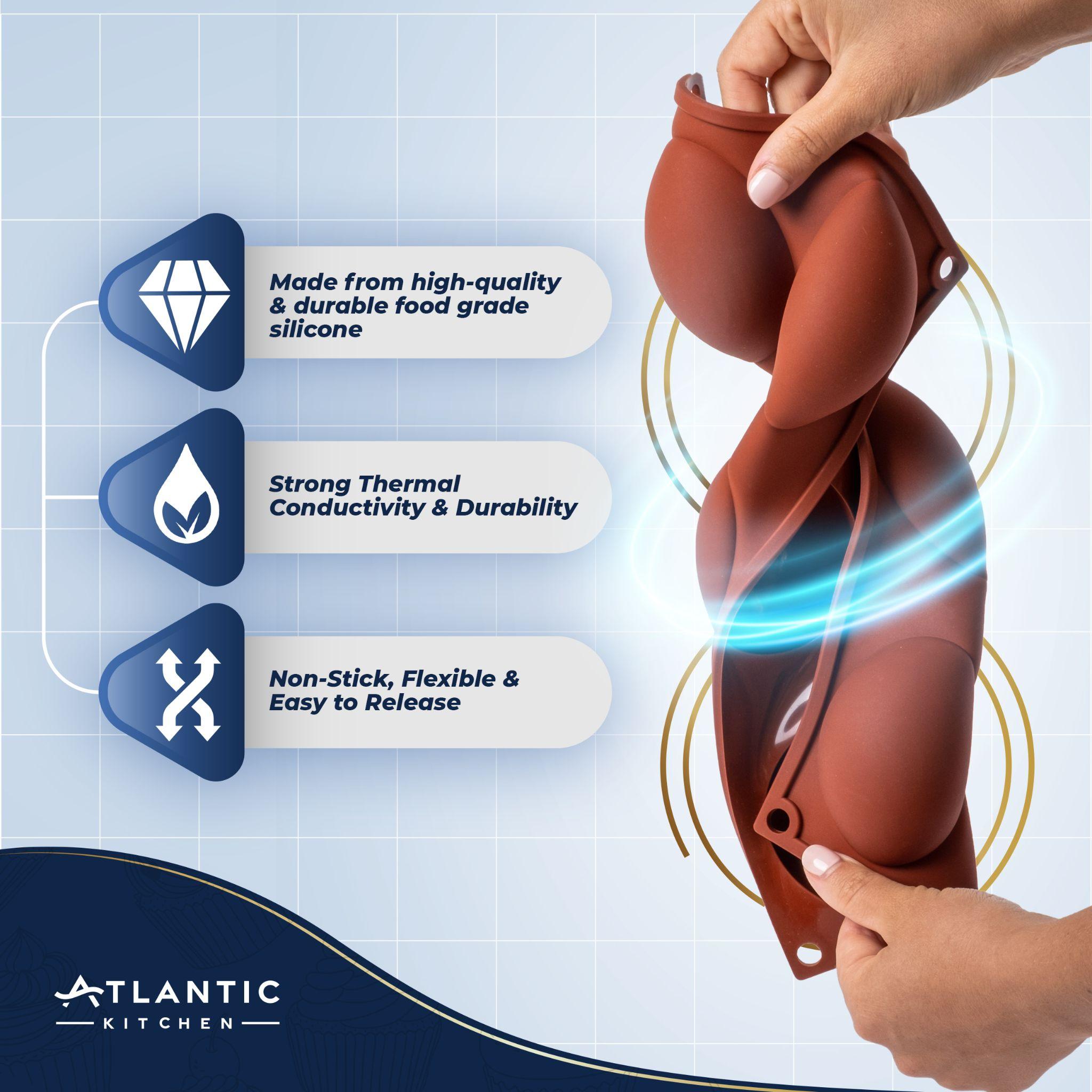
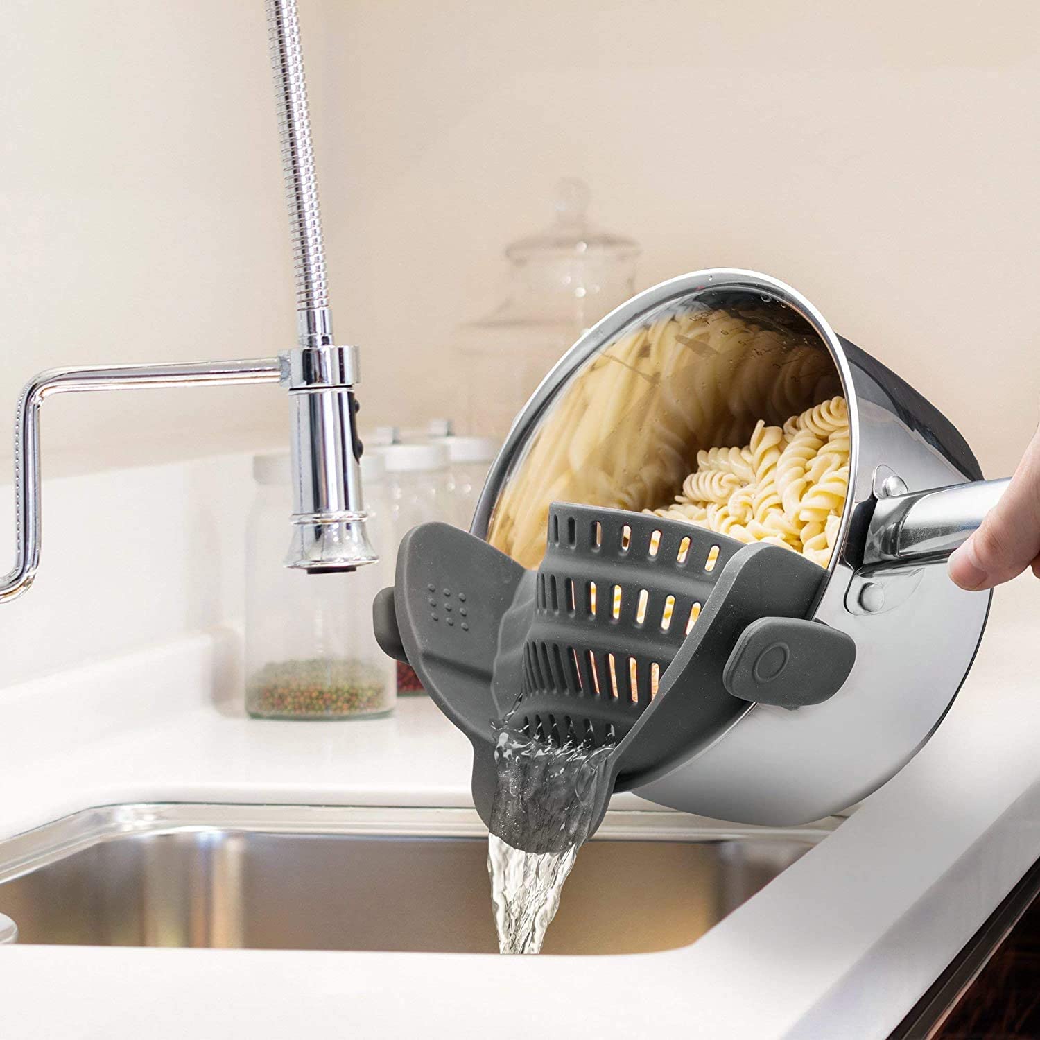
59. This twisting shot along with the graphic effects helps create a visual reference showing how flexible these materials really are. It also gives an understanding of their durability.
60. The illustration adds a helpful visual reference for the customer so they can identify how exactly they can use this product for better posture. The difference in a posture with and without the product is pretty evident from the visual reference.
61. Hand modeling, clear dimensions, and retractable pin in action help consumers grasp the idea of how compact and pocket-friendly the product is.
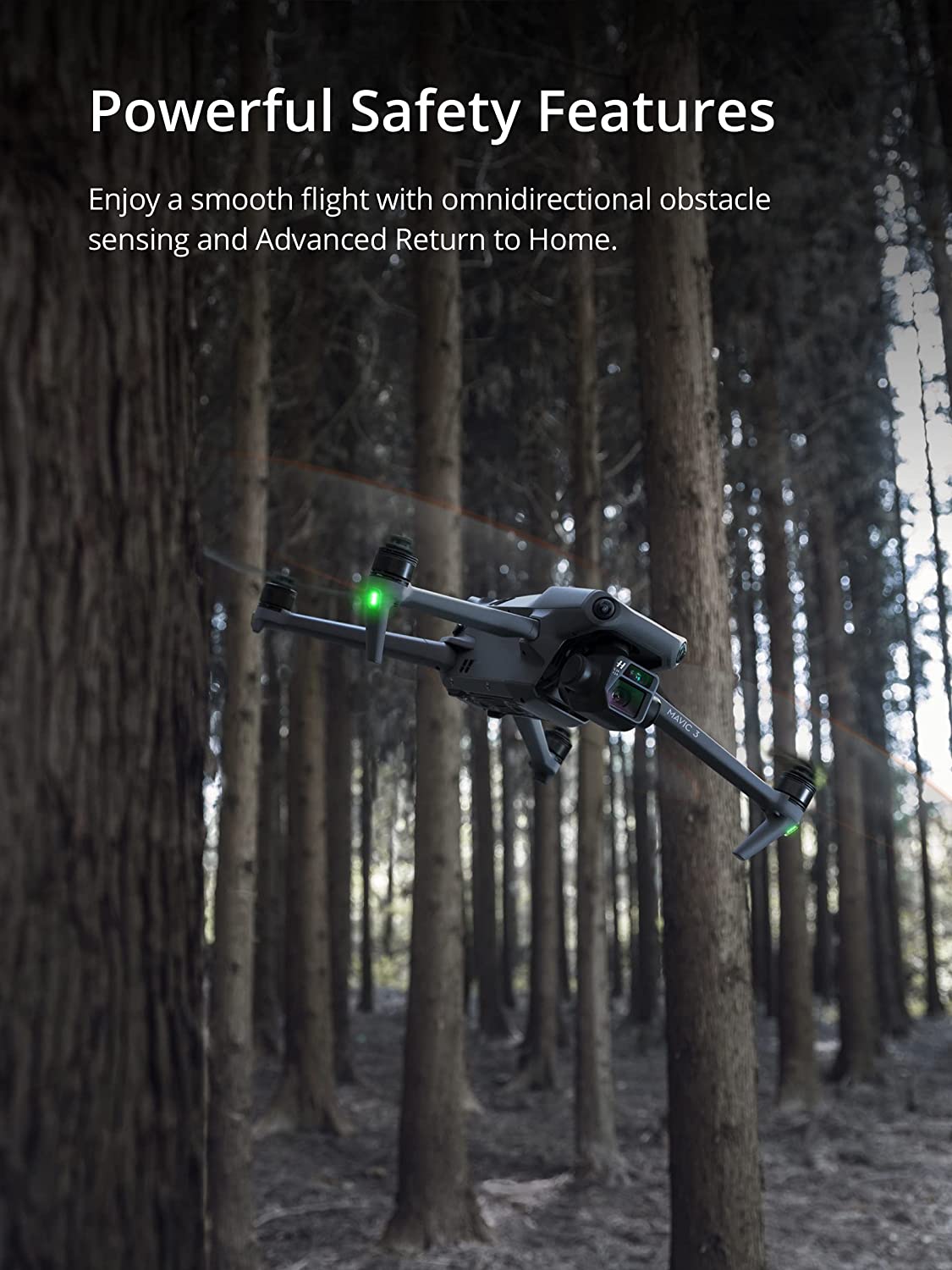
62. Image shows the product in action efficiently removing stains without affecting the quality of the fabric. The included message gives confidence and removes doubt from consumers’ minds.
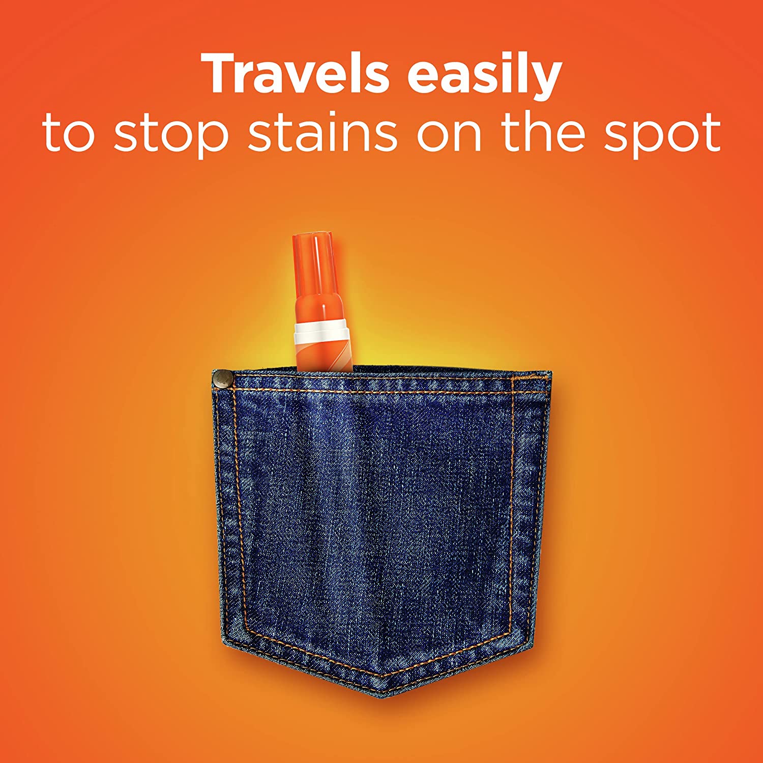
63. By ingeniously using the jeans pocket for visual reference. We can see both the size of the product itself and how that makes it easily portable.
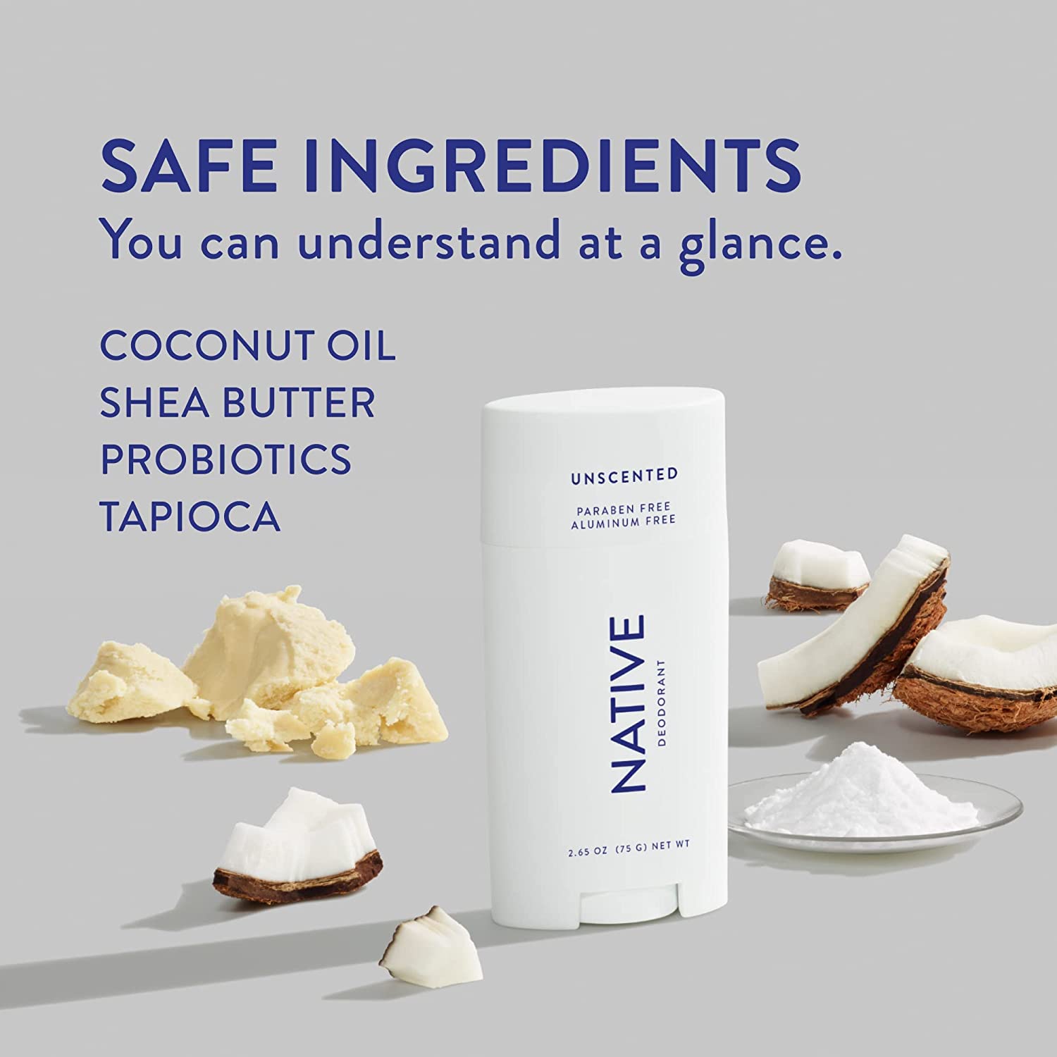
64. Those ingredients are not just props. They act as a visual reference for what makes this product so great which is its use of safe and natural ingredients.
65. With the use of an in-motion shot, this comparison infographic makes it easy to see how both products are true of different quality. The mark left on image right showcases a clear visual indicator that points out which company makes the better product.

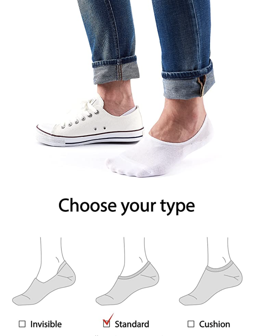
66. Using a hand model, the image gives proof the product can safely create a distance enough to prevent finger injuries. Answering questions and doubts through demonstration.
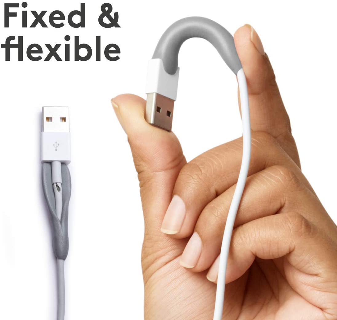
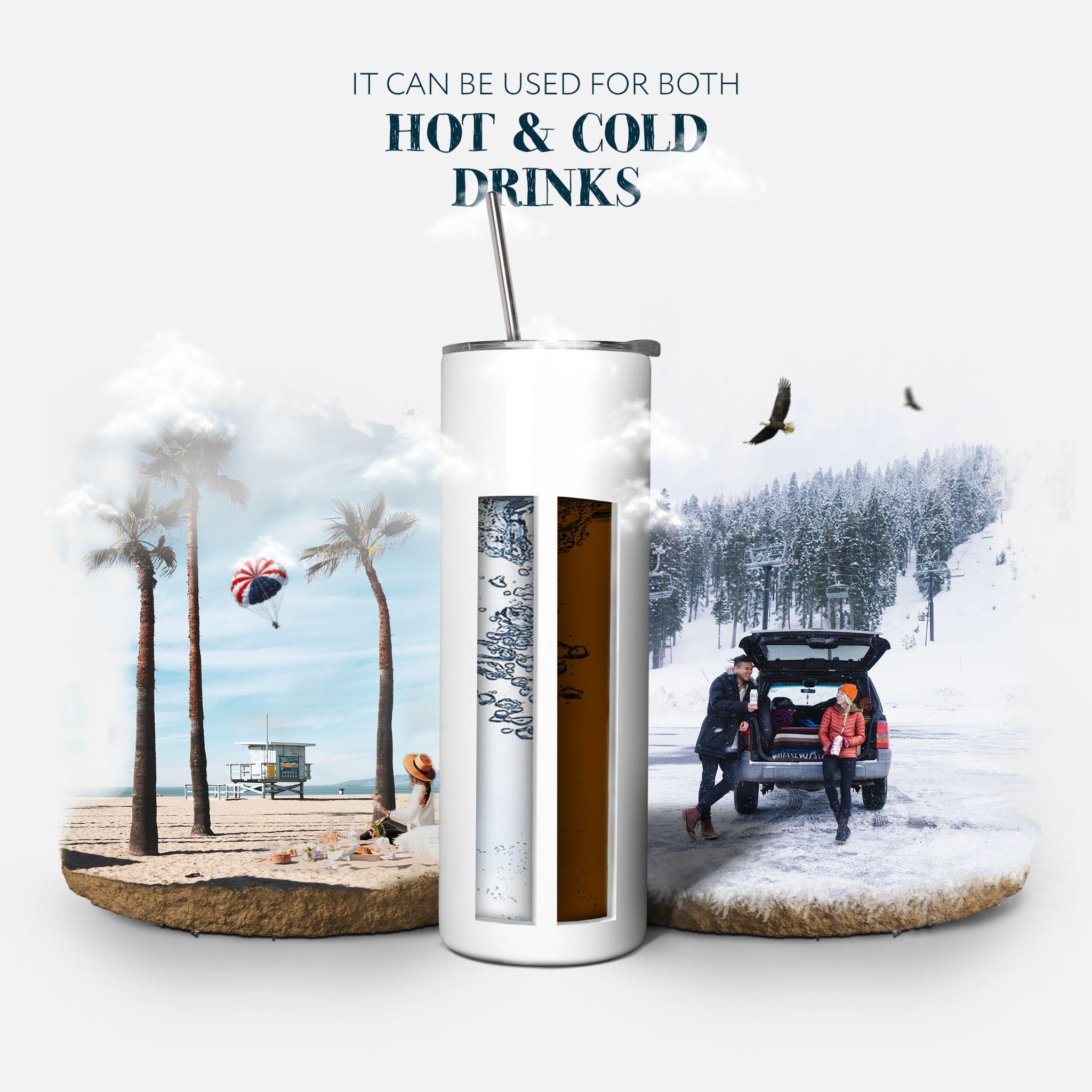
67. The inclusion of the hand in this image demonstrates the flexibility of the product. Its potential to prevent the wire from damaging is also clearly shown- showing the unique feature of the product.
68. The product’s portable size is made clear by placing it within the outdoor setting. While through text and icons, it’s clear that this power bank will keep your electronics charged up all weekend long!
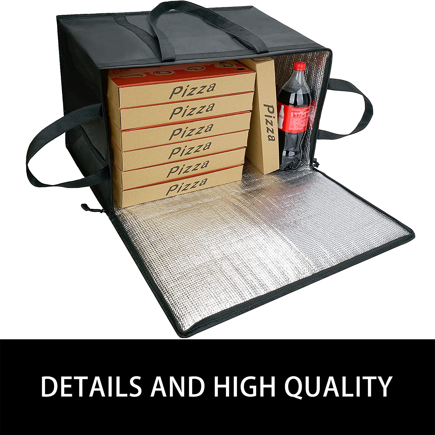
69. The detailed image emphasizes the space inside the product. These visuals show accurate storage capacity to consumers. It also gives them an idea that they can fit at least seven pizzas in the bag.
70. When consumers see the simple in-use shot, they not only get a visual of how to use it but also an idea of how their product will look before and after use. The product does not leave the surface sticky is demonstrated clearly.
71. To ensure the best experience for consumers, it is important to provide them with all relevant information. This visual reference of the hand under running water demonstrates its use and function. The insights provided through the infographic are letting consumers know all the details
72. The cleverly designed images with the 8 products strategically placed on one side provide a clear visual reference showcasing the storage capacity of the product. It also subliminally associates it with the convenience of carrying all the items inside this single product.
73. This intelligent shot-designed image not only showcases the function of the product. The visual reference about its convenience by including just part of one single hand is letting buyers know how they can add ease to their life.
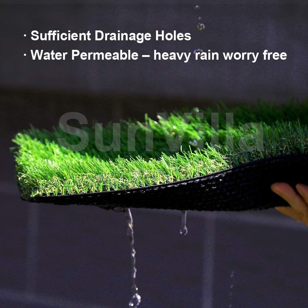
74. This is an example of a product feature action shot. By providing visual references for image text, this image makes it easier for consumers to understand what they’re reading and help sell the product better! Water permeability and sufficient drainage holes are shown in the image by demonstrating the product in action.
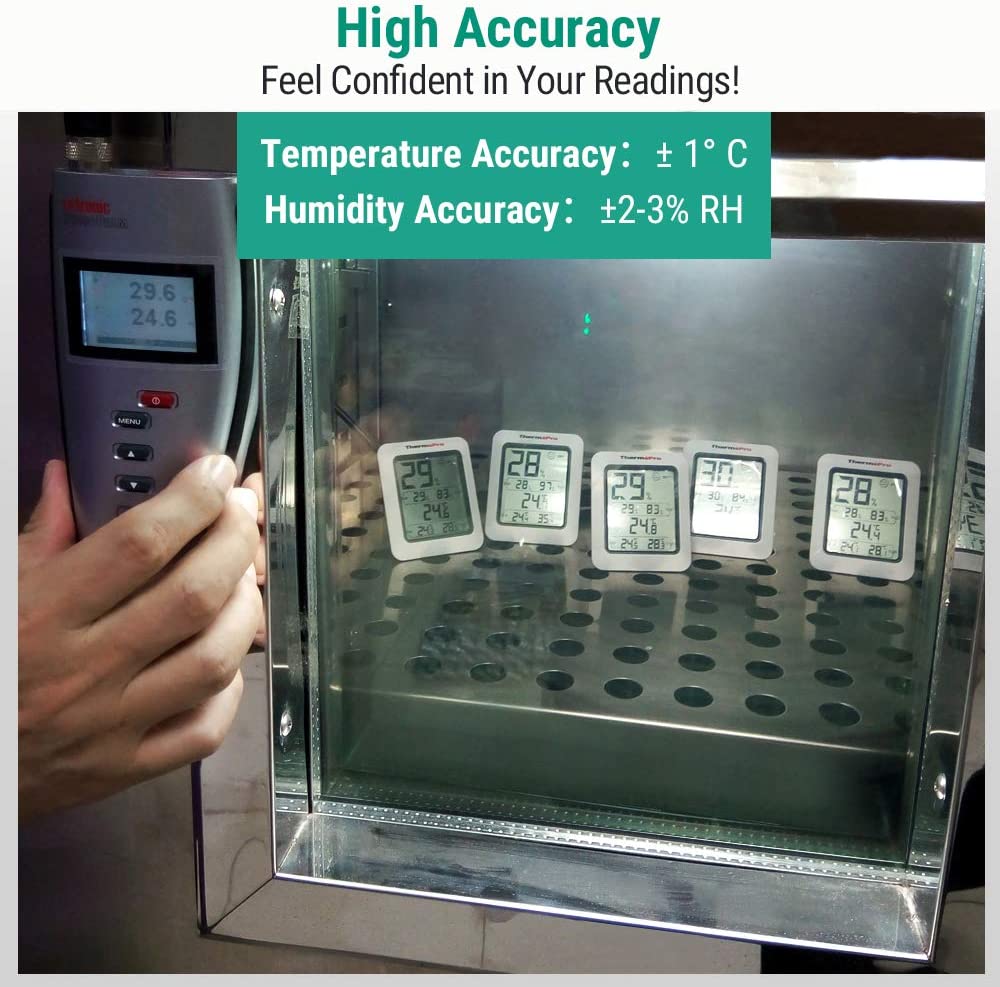
75. This image of multiple products being tested in a controlled environment with multiple visual references cleverly showcases the accuracy expected when they buy this specific product.
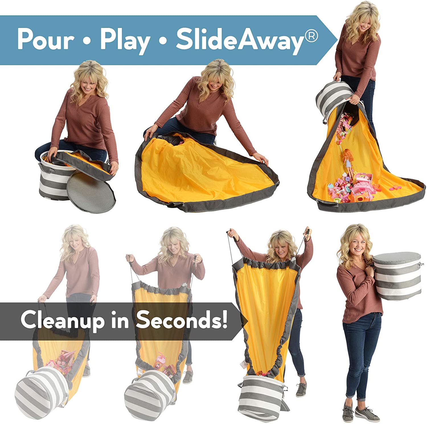
76. Instead of presenting two different products, the image offers a side-by-side comparison that helps consumers visualize how easy it is to set up and clean up the same product afterward.
77. The image captures the product’s uninterrupted flight and easy navigation in the challenging environment using an outdoor forest setting – giving the consumer a natural feel and calls to their adventurous spirit.
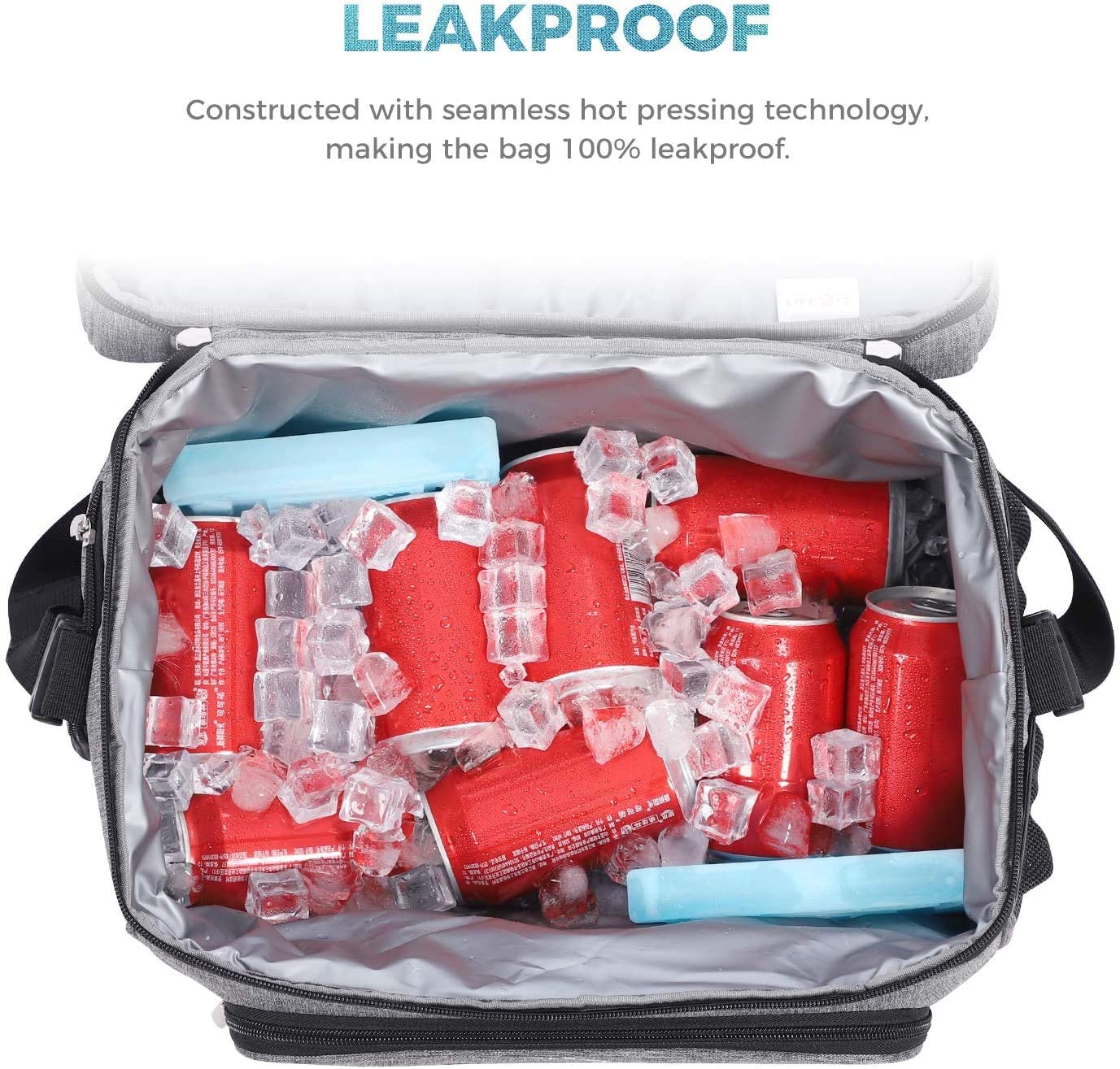
78. This image clearly shows that it can keep these beverages cold without a hassle. There is no water leaking from the bag in the picture. The presence of ice in the box with zero signs of leakage demonstrates its effectiveness.
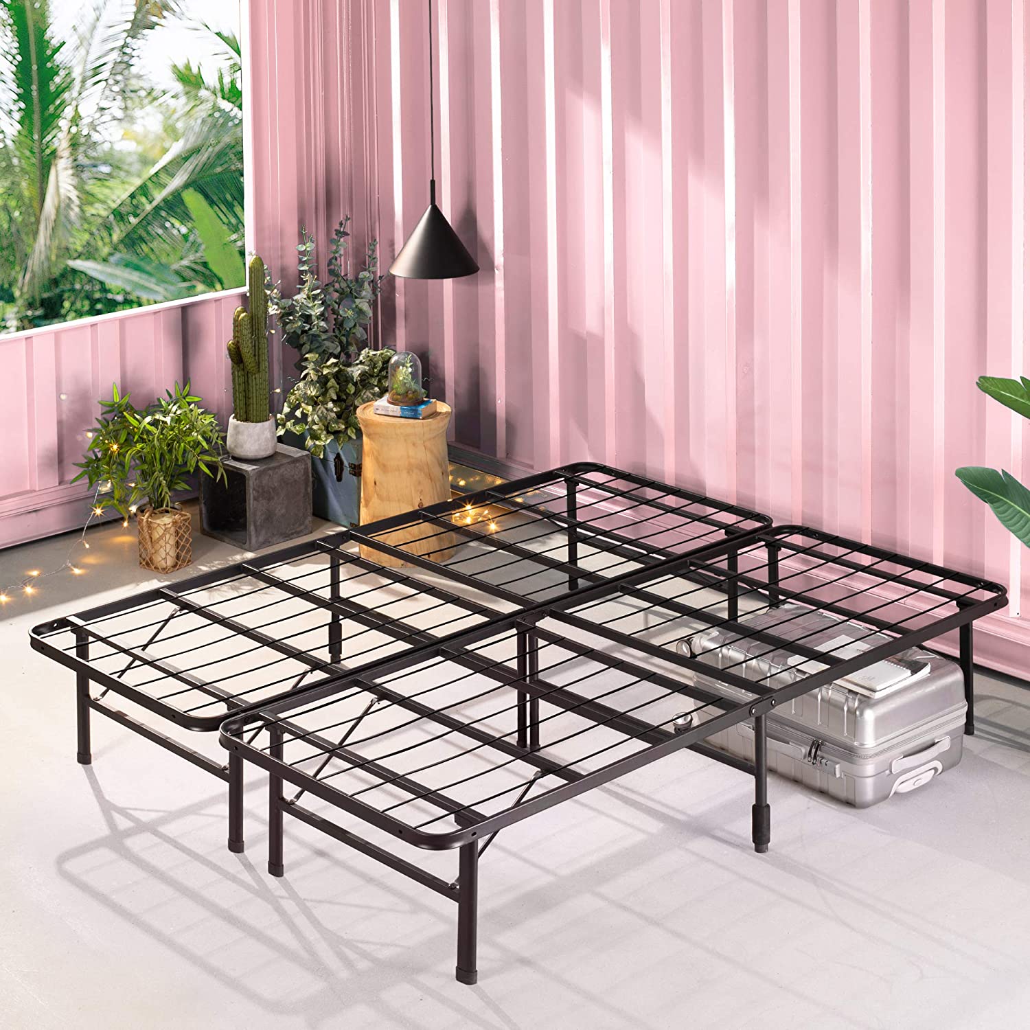
79. Consumers see the entire product in this image without any obstructions. The design and structure are meant to display the high quality of the product. The image also gives an idea of dimensions to customers. The placement of the suitcase under the frame shows that it has enough space underneath so users can slide stuff under the bed without any trouble.
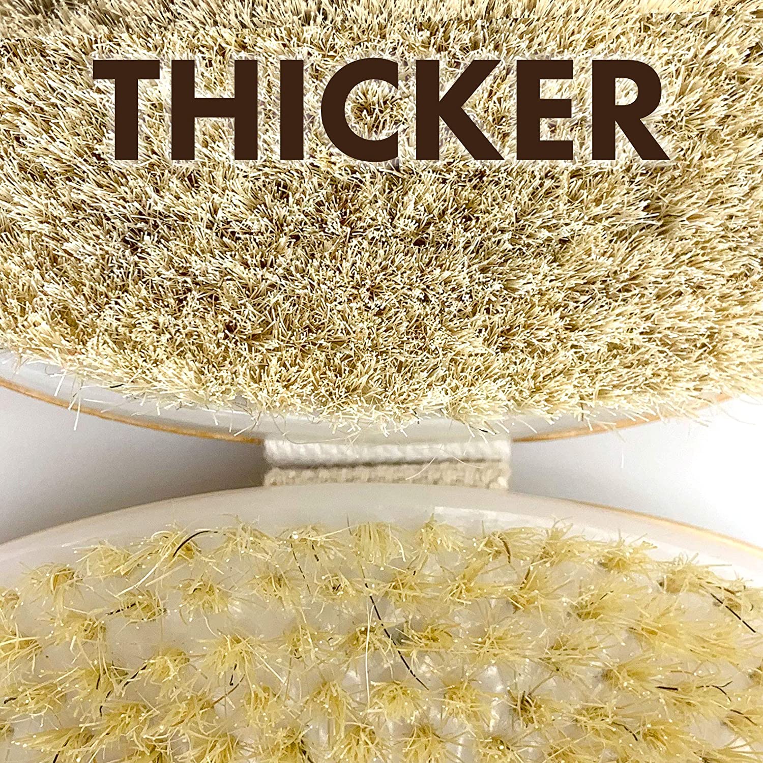
80. When the consumer sees the zoomed-in comparison shot, it’s easy to understand why this product is better. The thicker texture and more realistic appearance make for an easier decision and what they can expect.
81. This visual reference of the product in use offers a transparent look into how the standard size socks will appear when worn by the consumer. It addresses all the concerns that buyers might have when buying socks by using a model foot with and without the shoe.
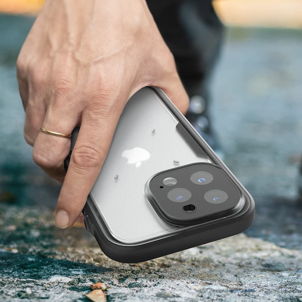
82. Both extreme weather conditions on either side of the product beautifully showcase this products’ ability to keep your drink cold and hot even in extreme weather.
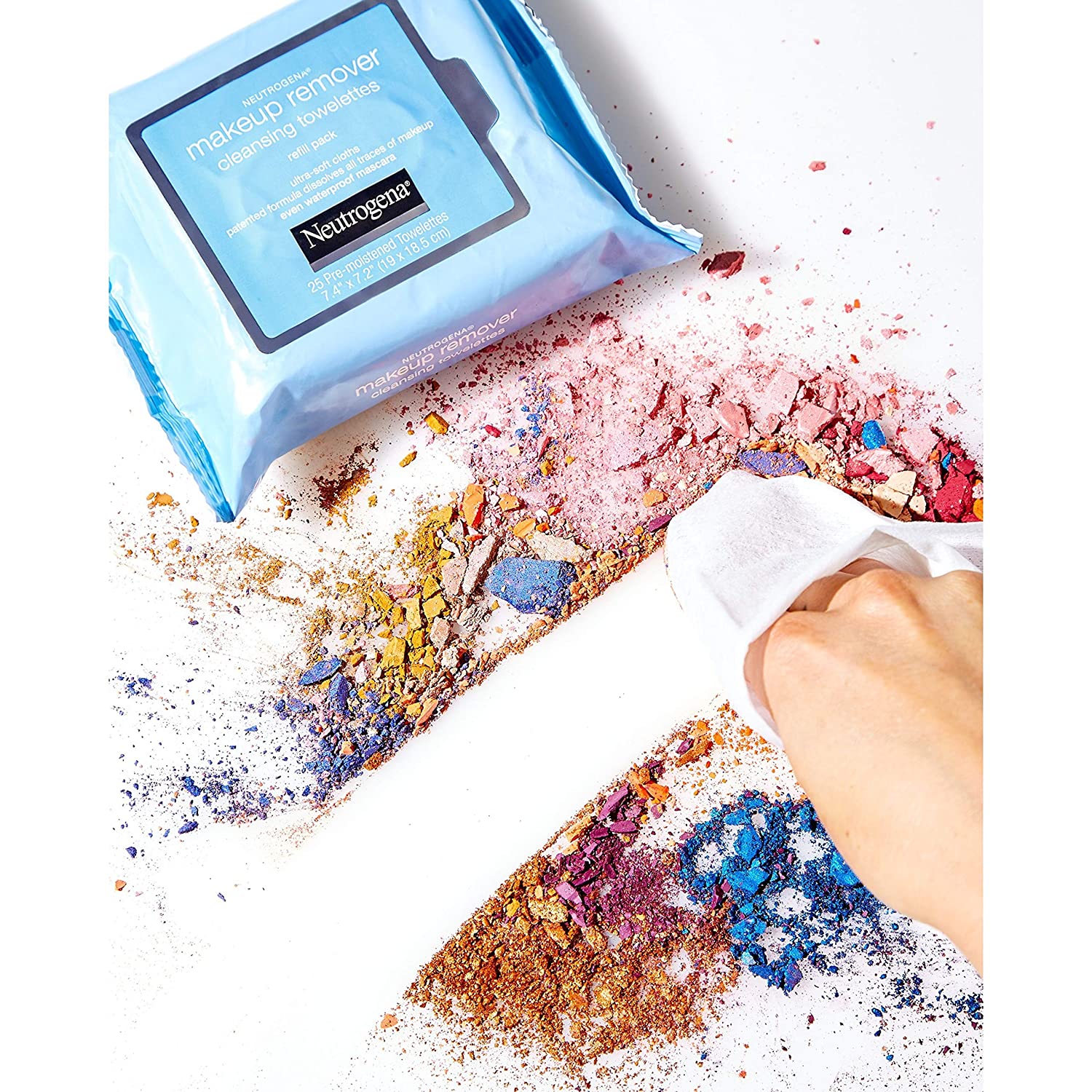
83. The image makes a confident statement about the product. It is wiping even the smallest makeup particles in one swipe. The visual reference shows the effectiveness of the product.
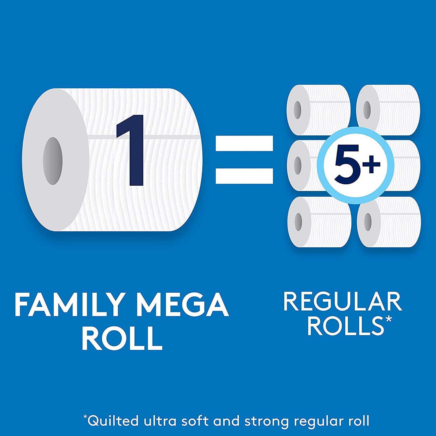
84. When consumers see this image, they will focus on the quantity of the product. The direct comparison shows that this product is equal to five regular rolls.
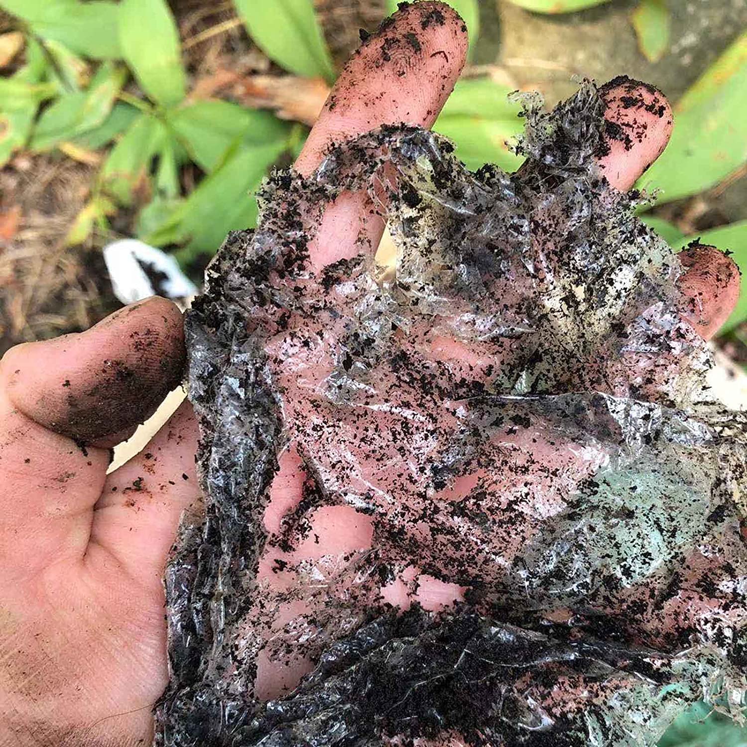
85. The eco-friendly feature of this product makes it a great choice for those who care about their Earth. Biodegrading abilities of the product are highlighted by mixing the product with the soil so that users can actually see that it is a biodegradable product.
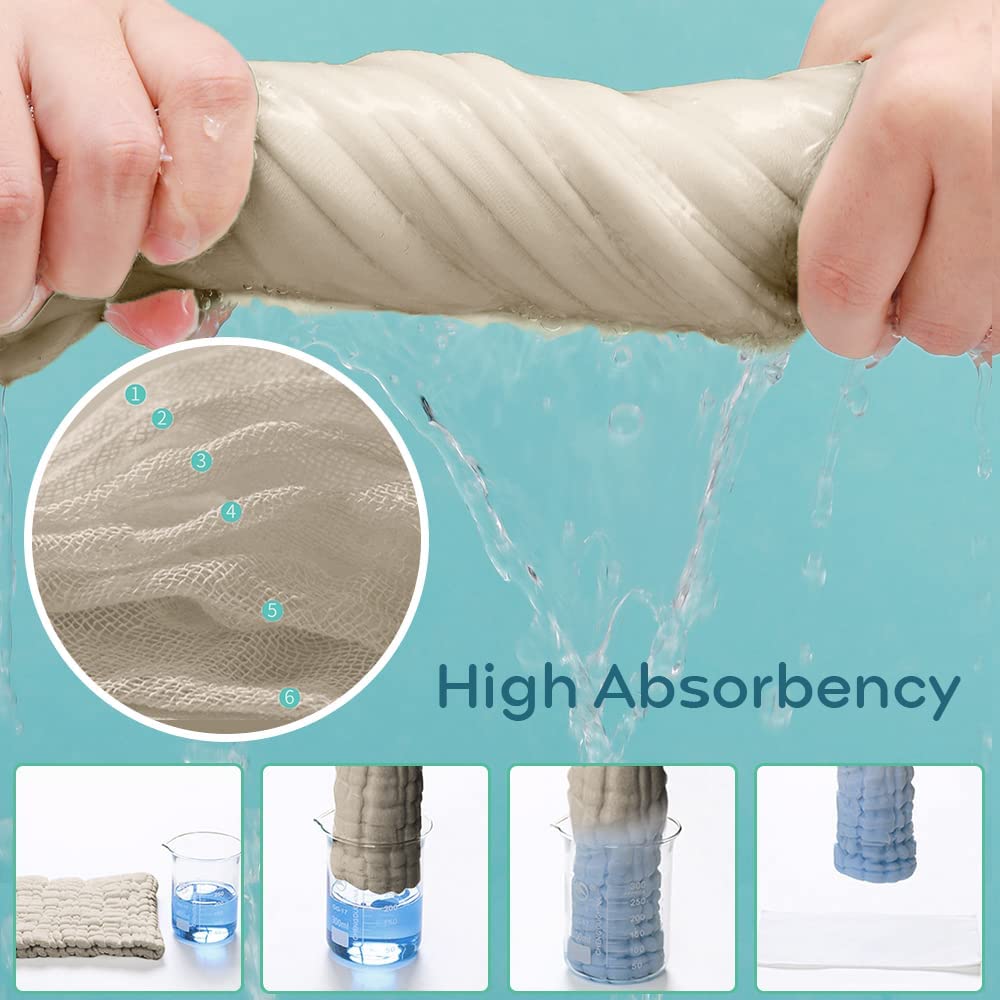
86. A zoom-in of 6 absorbent layers, heavily doused fabric in wringing action and the four images together demonstrate step by step visuals to show the super absorbency of the product.
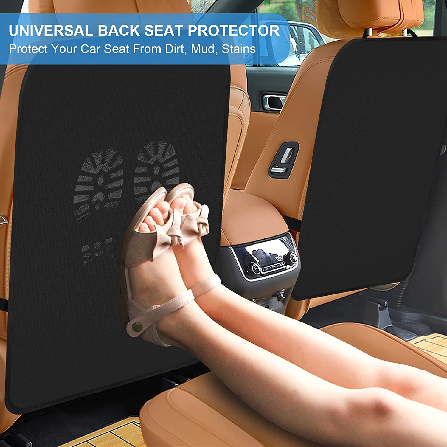
87. The footprints create a strong sense of uneasiness as no one likes dirt stains on car seats. Visuals show consumers that they can escape these nasty stains with the product. Footprints are now getting on the protector instead of the back of the car seat which is pretty evident in the picture.
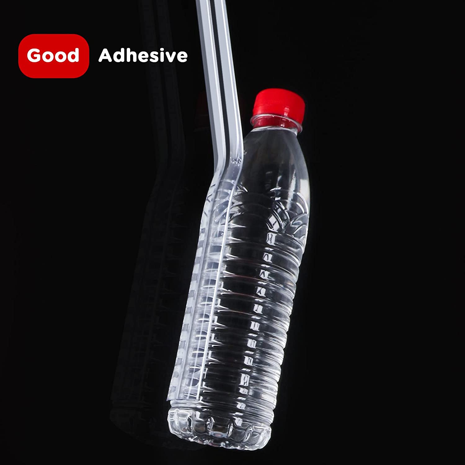
88. The visual reference displays the strength of the adhesive product suspended in the air. Minimalistic design of the image leaves a simple yet impactful effect on the audience.
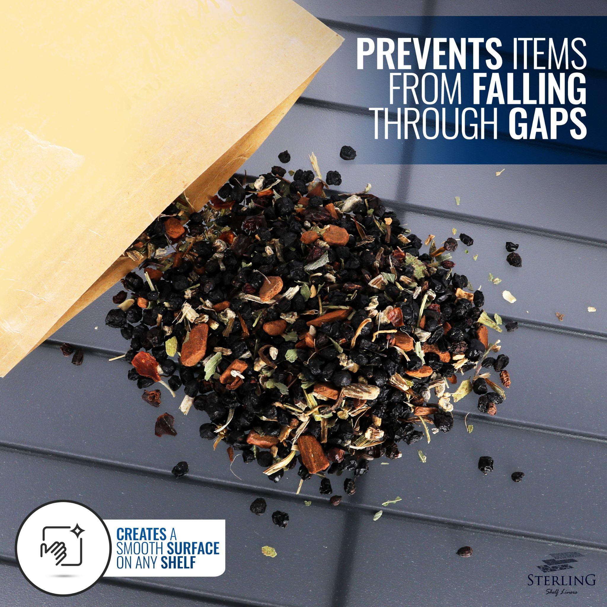
89. The close-up picture of the shelf liner shows the quality of the product. Even the smallest particles are not falling from the gaps. The header text and footer text also validates the visual reference. It shows customers that the liner forms a smooth surface on any shelf. So, the text reinforces the main point of the image.
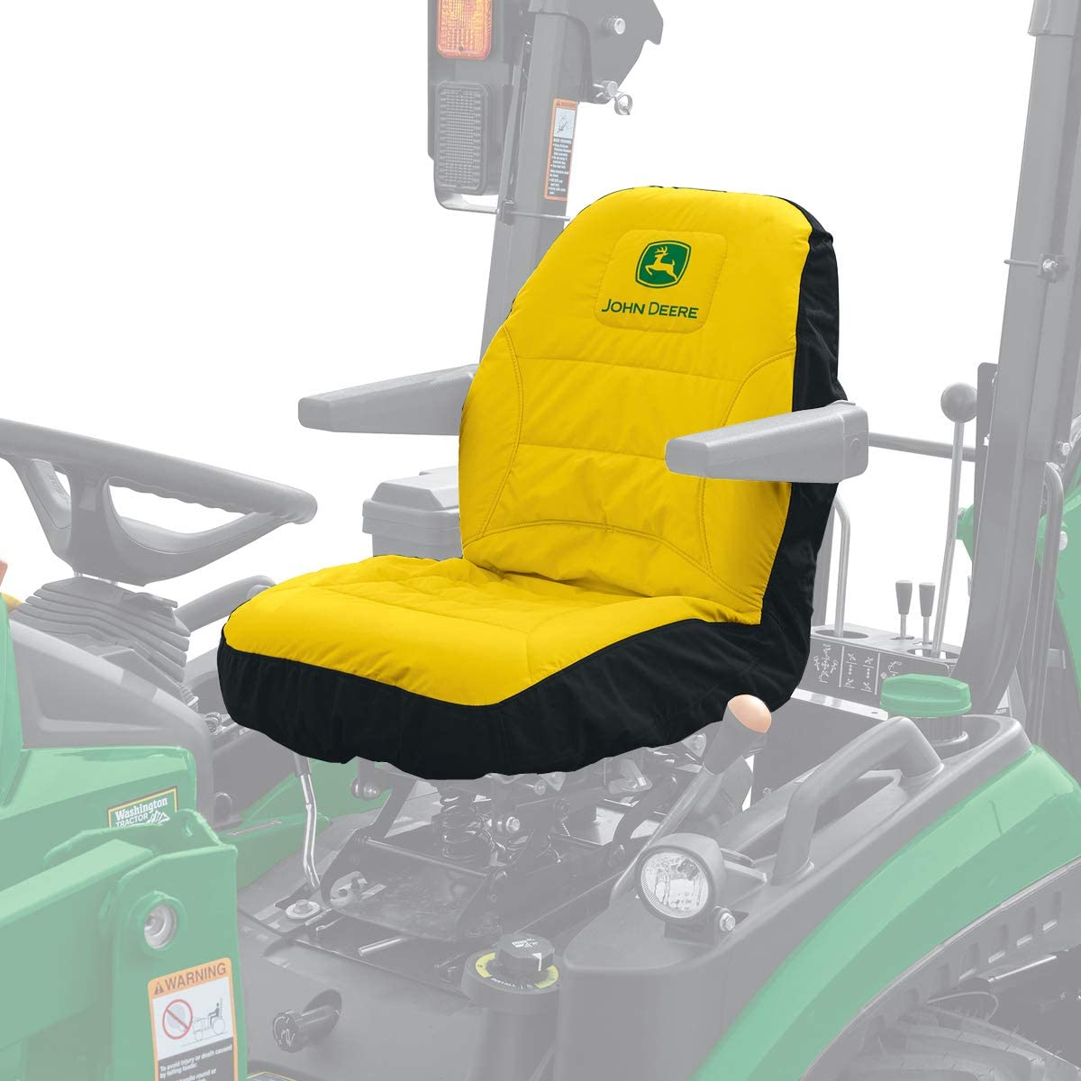
90. Consumers can understand the position of the seat with this visual reference. The image also helps in showing the ideal fitting of the forklift seat.
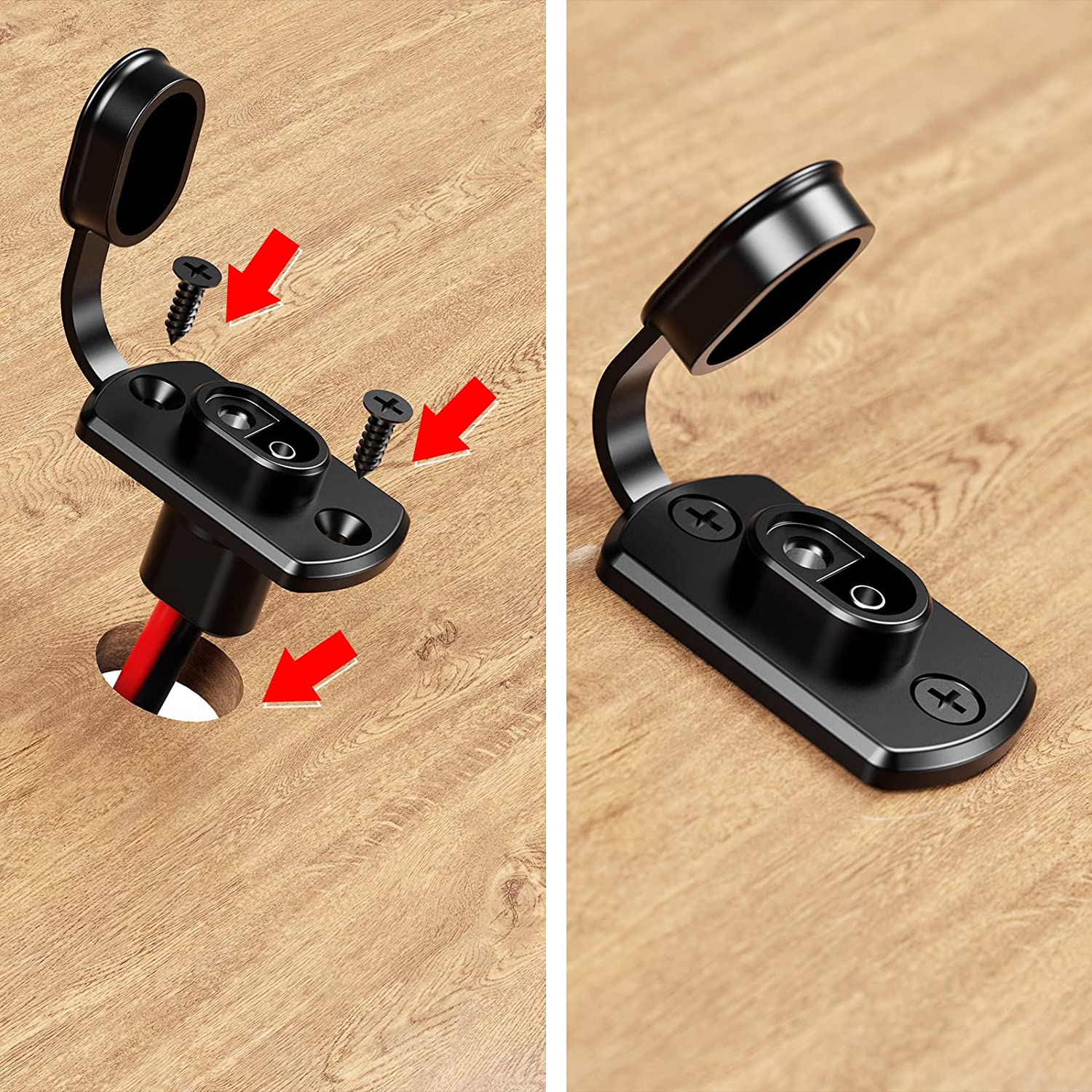
91. The visual reference contains instructions for customers. The arrowheads show the precise location of screws. So, the image helps customers to learn about product assembly. It also creates a perception that the product is easy to assemble.
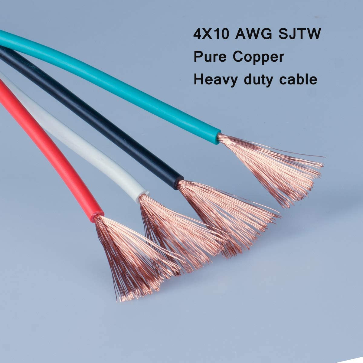
92. High-resolution visuals focus on the quality of the copper. Customers can relate the features to the product in this image without any external text. So, showing the material is better than writing about it.
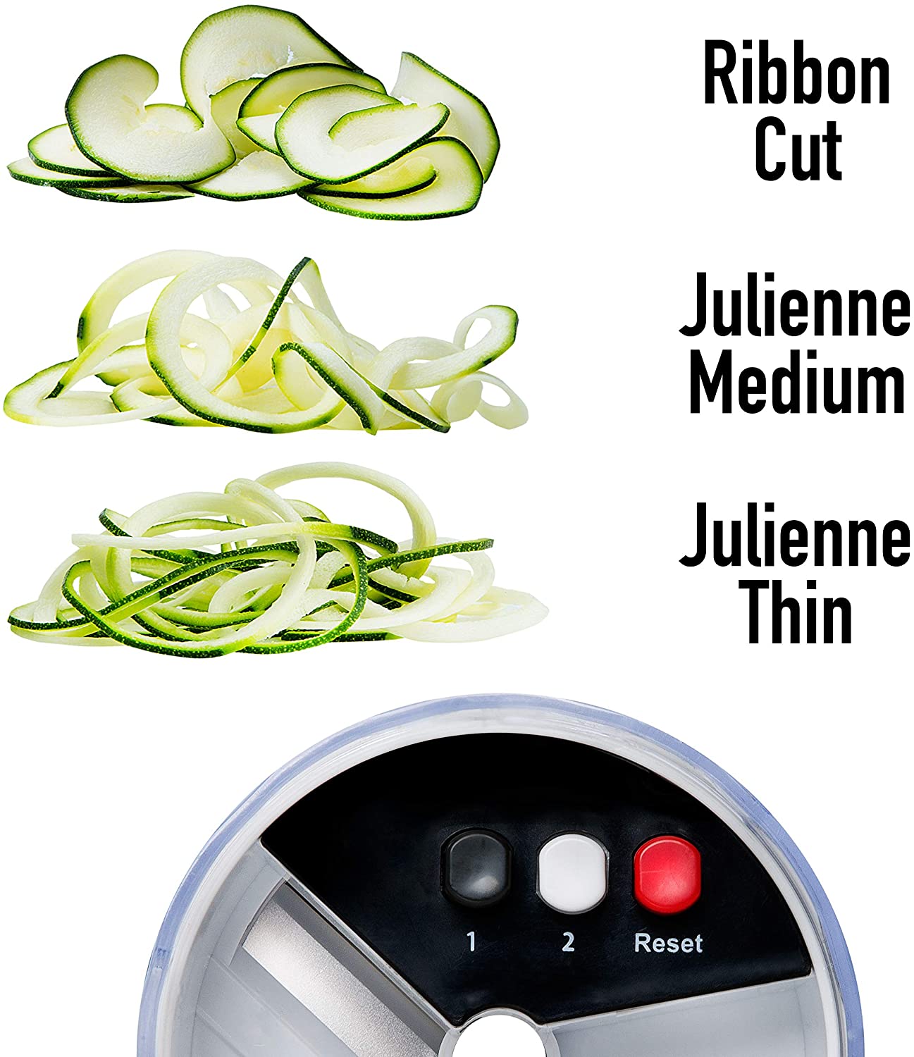
93. The image shows the three types of cuts possible with the product. They are used as visual references to help the buyer understand how each cut is different and how each will look once done.
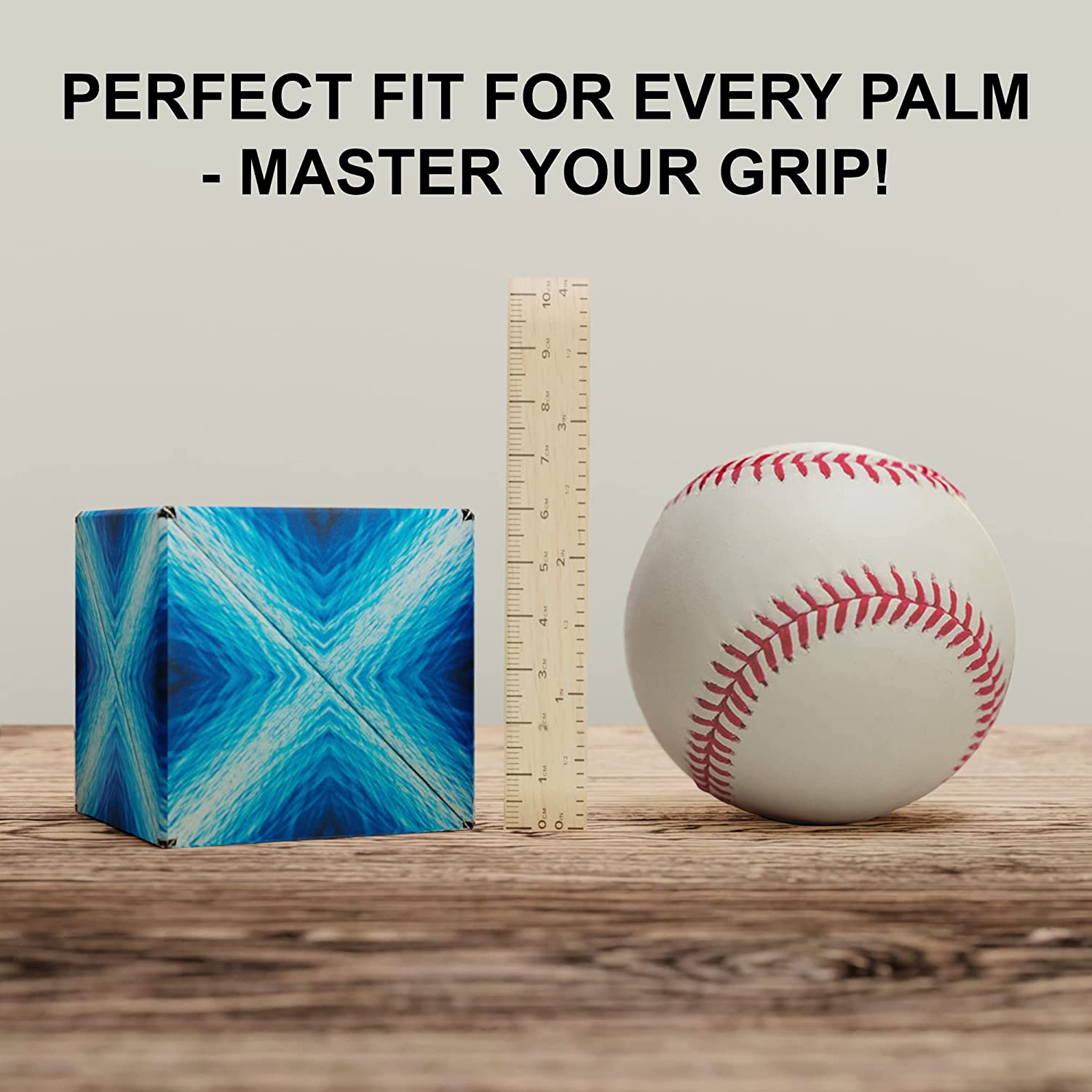
94. The rule measure shows the actual size of the ball in the image. Consumers know that it has a specific height shown on the scale. It is an ideal way of visualizing the dimensions of any product.
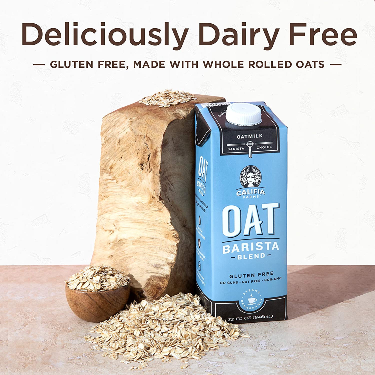
95. Placing the product alongside the natural ingredient pleases the customers. These visuals help customers to associate the product with oats. They will think of healthy oats every time they see the image.
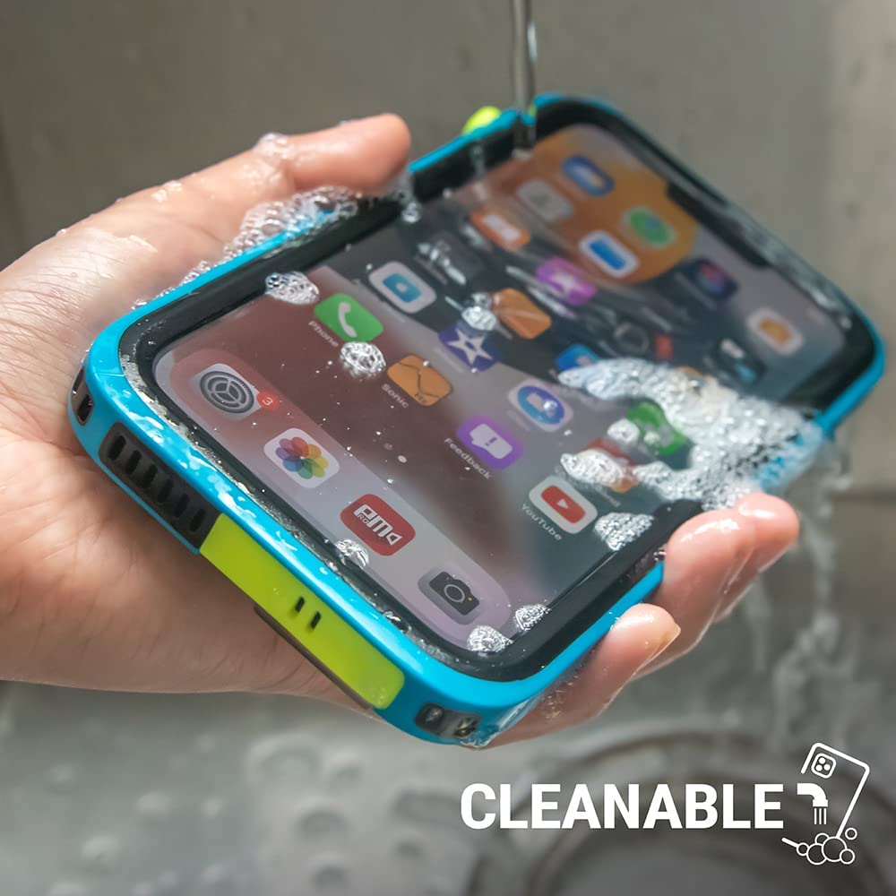
96. The visual reference is convincing as consumers never wash the phone with water. When they see the phone working in water, they applaud the resilience of the phone case. So, the detailed image highlights the cleanability of the product.
97. The background shows dirt and rough terrain. It implies that dropping the phone on hard surfaces will not cause damage to the screen. Dirt and uneven terrain make consumers think that this product is sturdy and durable.
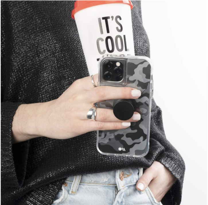
98. The grip is the main focus in this visual reference. Holding a coffee and a smartphone in one hand is not easy. So, the image shows that the handle makes it easy to carry the phone with other objects in hand.
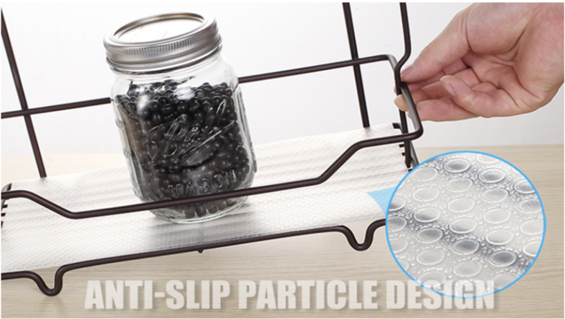
99. The product image showcases an anti-slip feature through an in-use shot. The tilted angle serves as a visual proof along with a close-up shot showing the textured base.
Your product deserves to be shown off in its most beautiful form, and that’s where our experts come into play! We’ll create remarkable listings images for you with a process that involves extensive research into getting all of those features & functions correct on Amazon – just let us know how much time or money is worth investing into making sure your brand stands apart from competitors. To give your listing the best chance of being found by customers on Amazon, get help from our professional graphic designers and photographers who can create images that are both creative and appealing.
I hope this was helpful. If you have any questions, please feel free to reach out to us at [email protected] or request a free audit. If you need any help with your Amazon product photography or listing images, schedule a call with one of the team members using this link.

Kamaljit Singh is the Founder and CEO of AMZ One Step and a former Amazon seller. Kamaljit has been featured in multiple Amazon podcasts, YouTube channels. He has been organizing meetups all around Canada and the US. Kamaljit has over 350,000 views on his Quora answers regarding FBA. Kamaljit also founded AMZ Meetup where he organizes conferences for Amazon sellers.